Identité de marque pour un service logistique
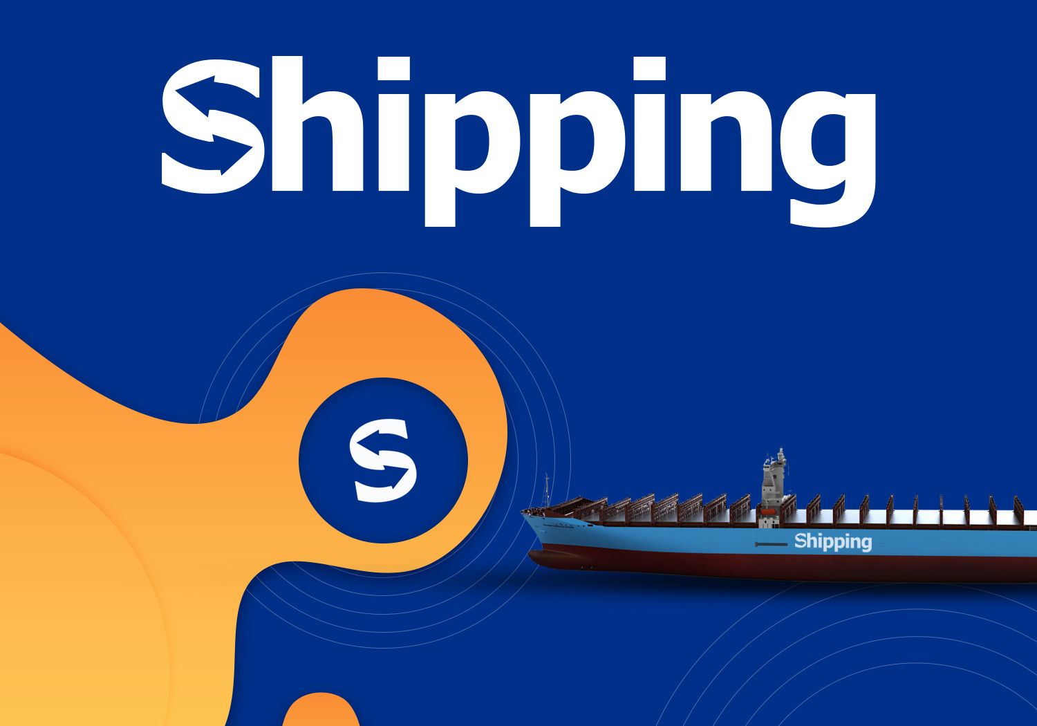
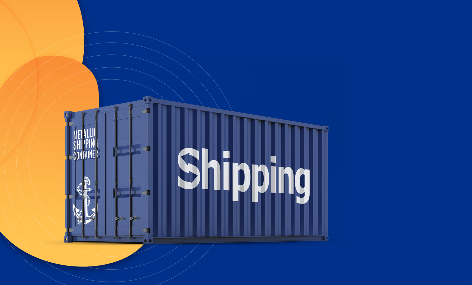
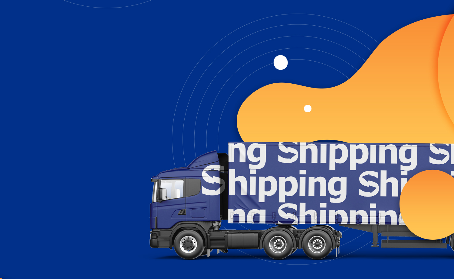
La logistique, c’est lorsque tout est en mouvement, mais reste stable en apparence. Pour Shipping, nous avons créé une identité qui fonctionne comme un itinéraire parfaitement optimisé : claire, évolutive et sans retard. Le bleu évoque à la fois la mer et le ciel, tandis que le signe lui-même suggère le mouvement — rappelant que la cargaison est déjà en route. Le résultat est un système qui fonctionne aussi bien sur un conteneur que dans un environnement digital. Car un grand service doit donner l’impression d’avoir déjà tout livré à temps.
Identity
A route, not a logo
For Shipping we created an identity that works like a well-optimized route: clear, scalable, and without delays. Blue here speaks both of the sea and the sky, while the mark itself conveys movement, a reminder that the cargo is already on its way.
The result is a system that feels confident both on a container and in the digital environment. Because a large-scale service should look like it has already delivered everything on time.

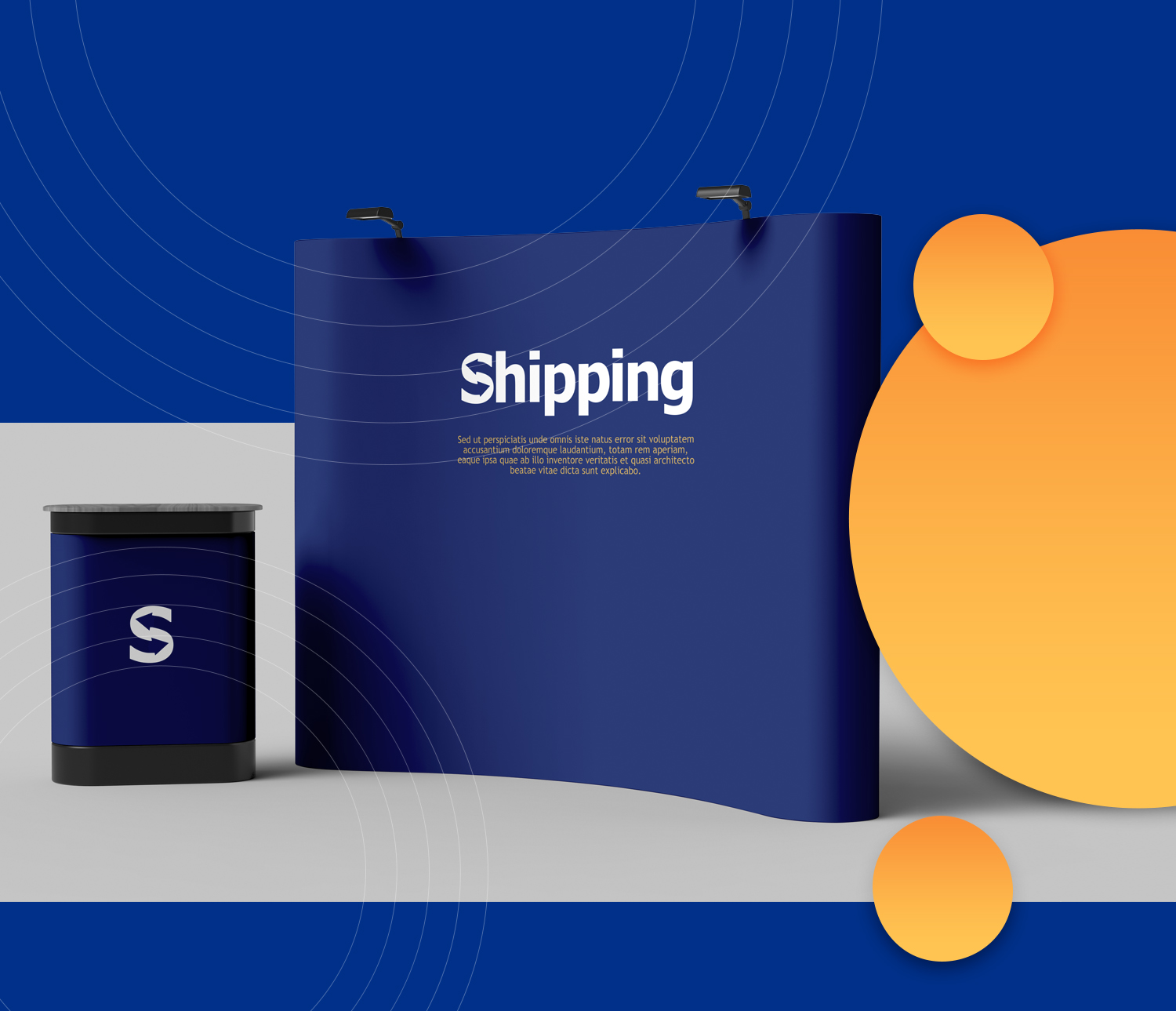
The stand: the same system at exhibition scale

- Client
- Shipping
- Secteur
- Logistique