Brand Identity for a Logistics Service
Logistics is when everything is in motion, yet appears stable.
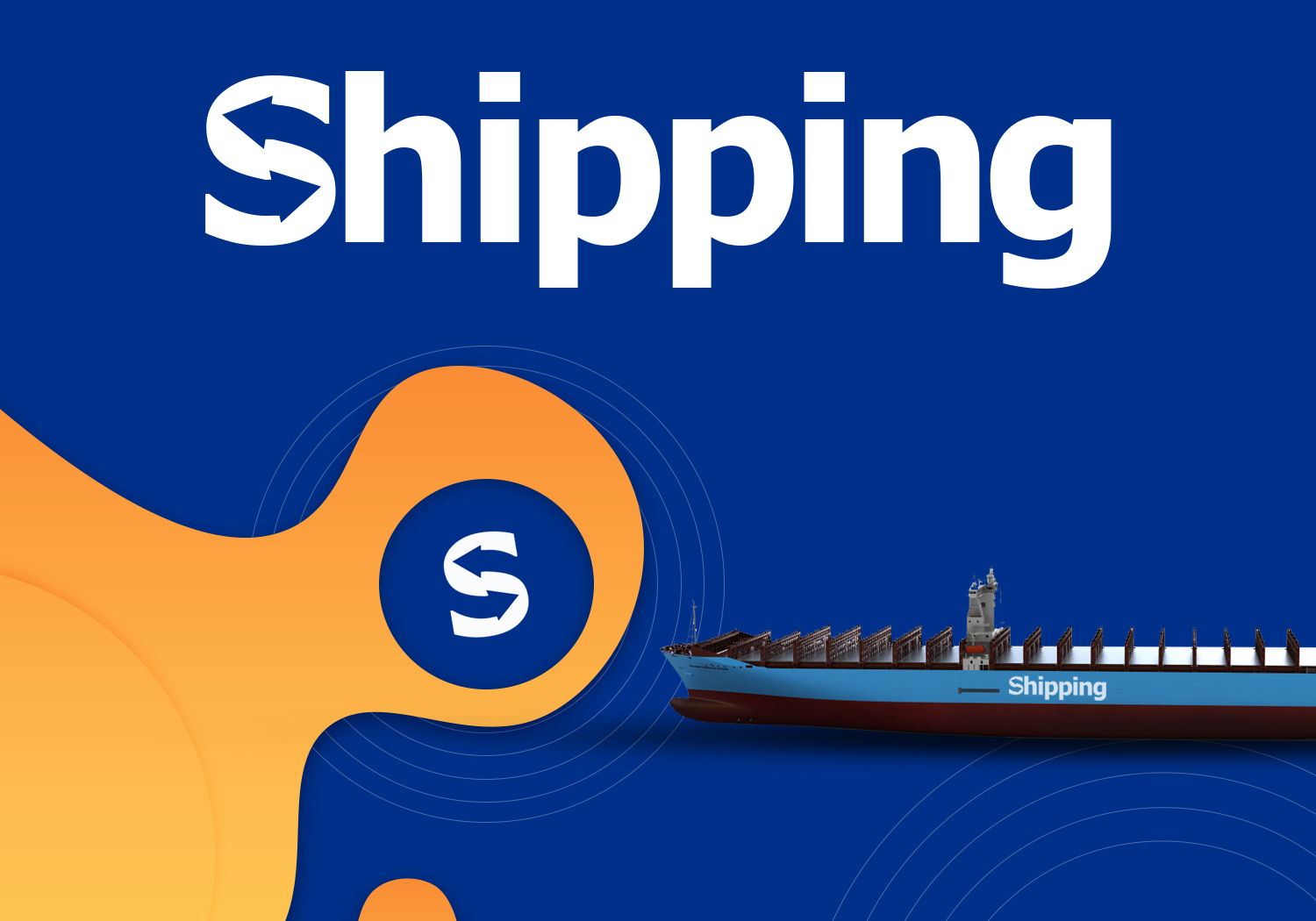
Identity
A route, not a logo
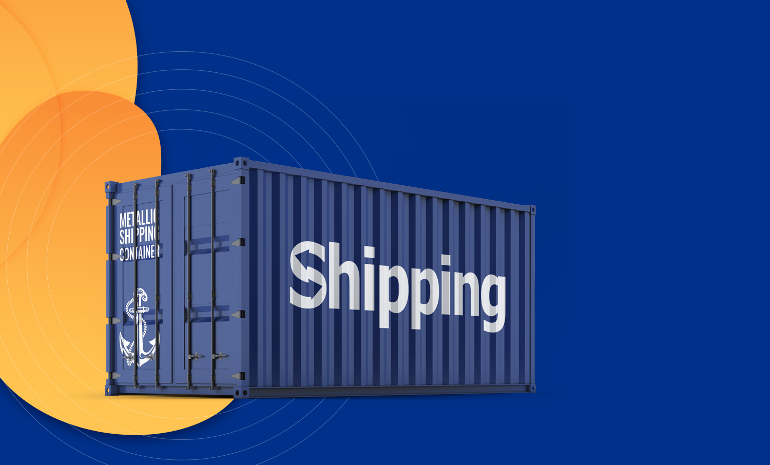
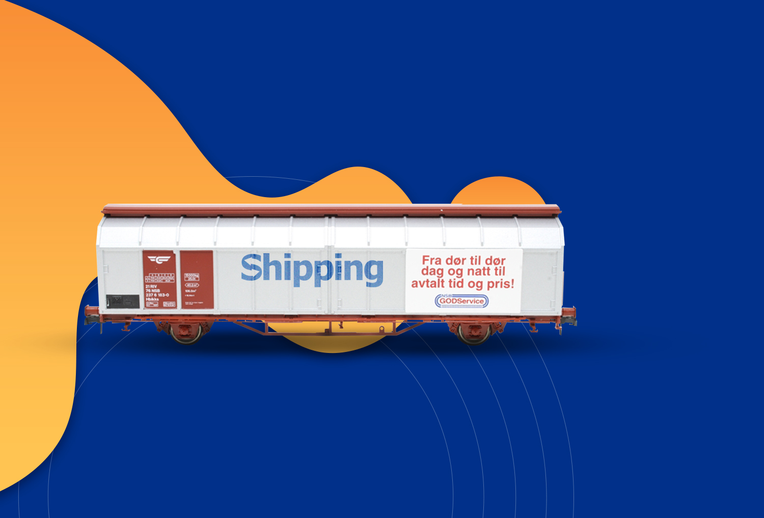
For Shipping we created an identity that works like a well-optimized route: clear, scalable, and without delays. Blue here speaks both of the sea and the sky, while the mark itself conveys movement, a reminder that the cargo is already on its way.
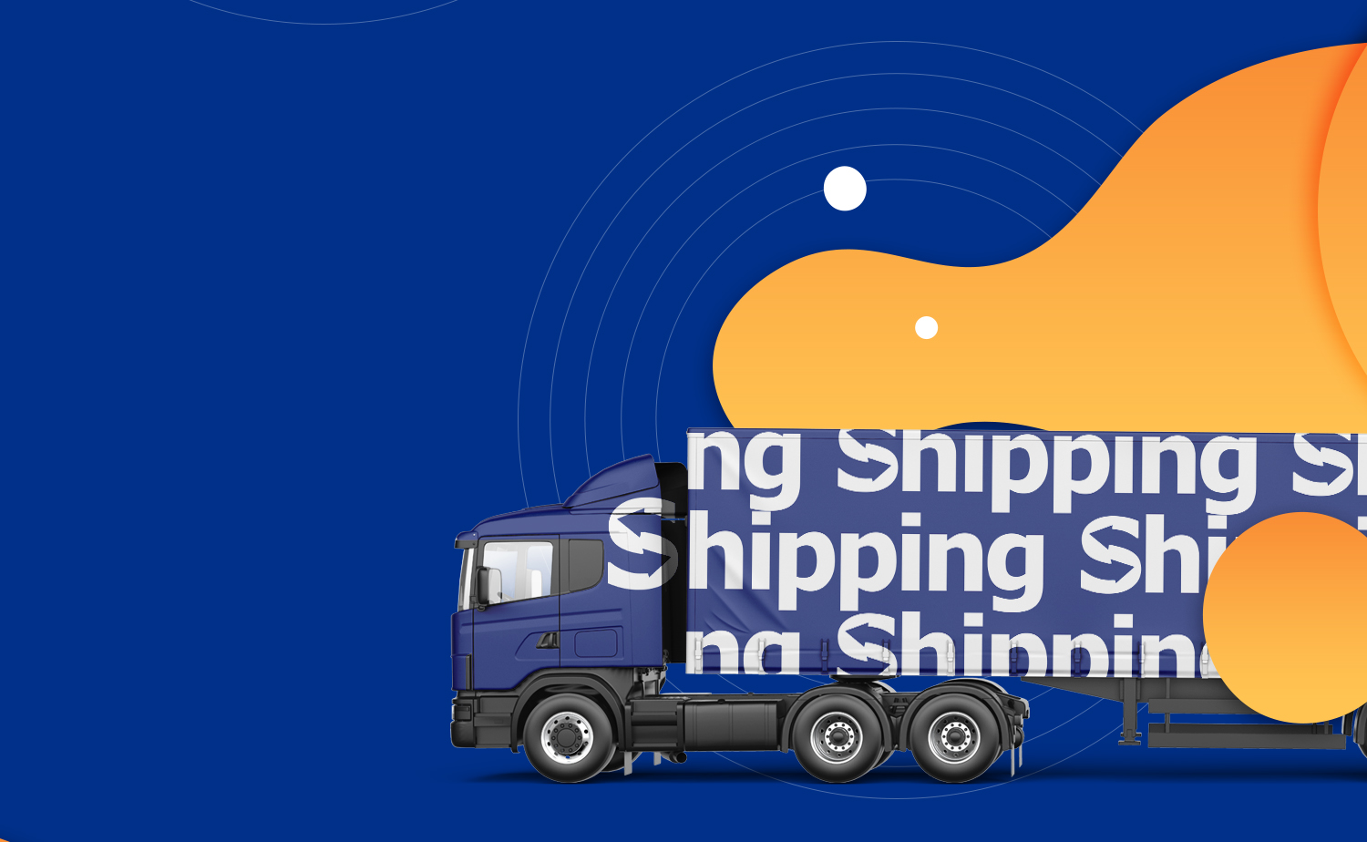
The result is a system that feels confident both on a container and in the digital environment. Because a large-scale service should look like it has already delivered everything on time.

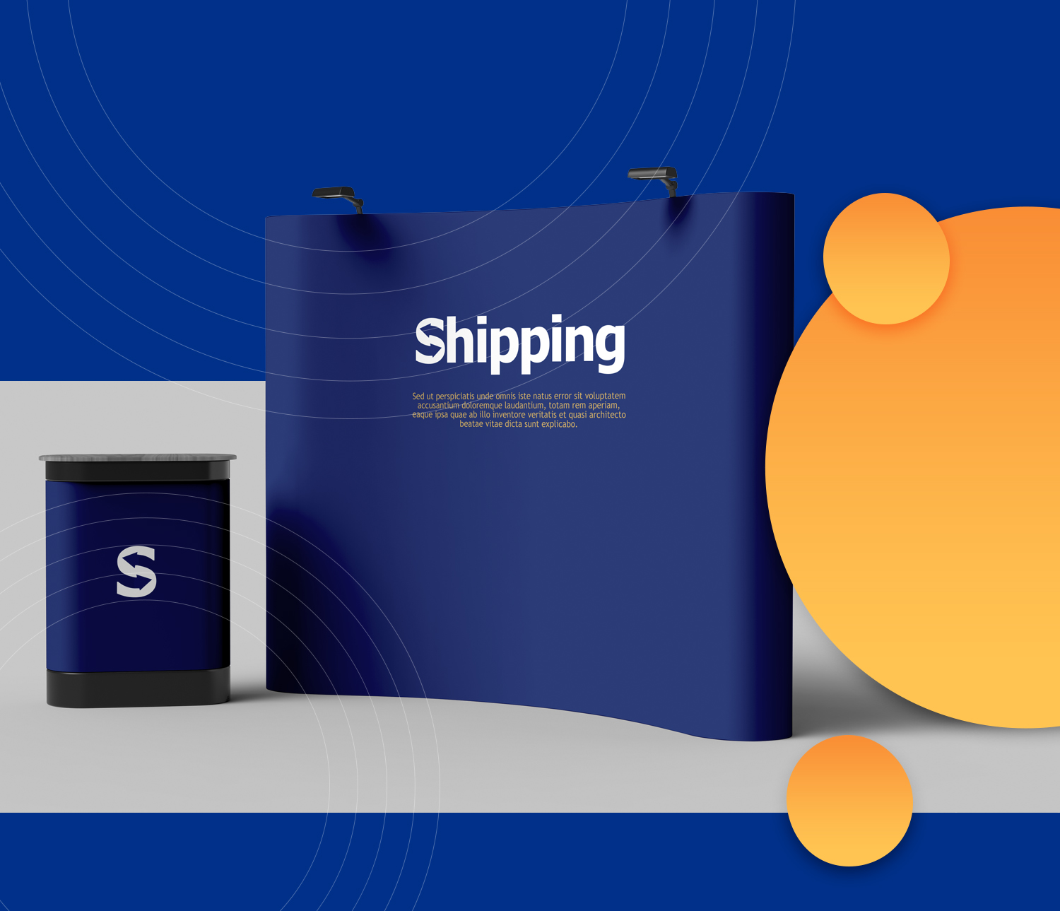
The stand: the same system at exhibition scale

- Ügyfél
- Shipping
- Szolgáltatás
- Branding & Identity Design
- Iparág
- Logistics