Karl Lorenz 2023
Sturdy brand identity for the venerable German construction firm Karl Lorenz
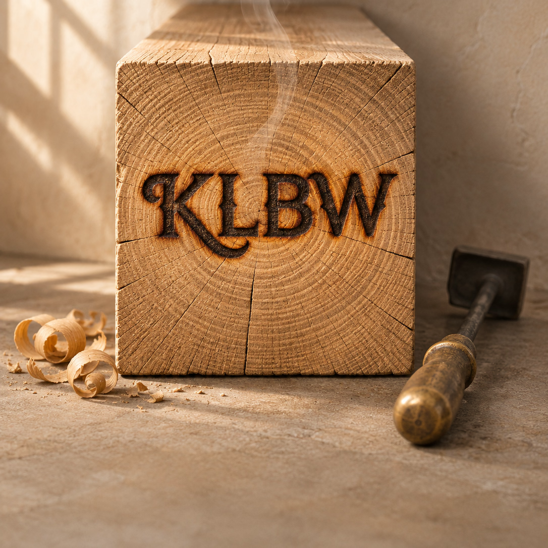
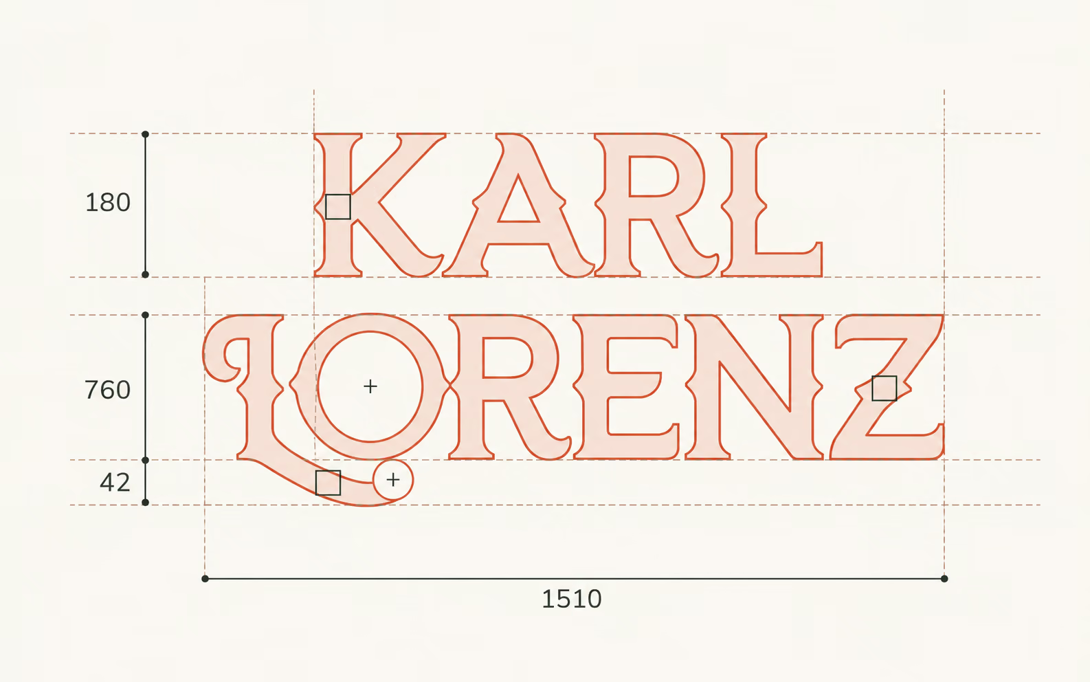
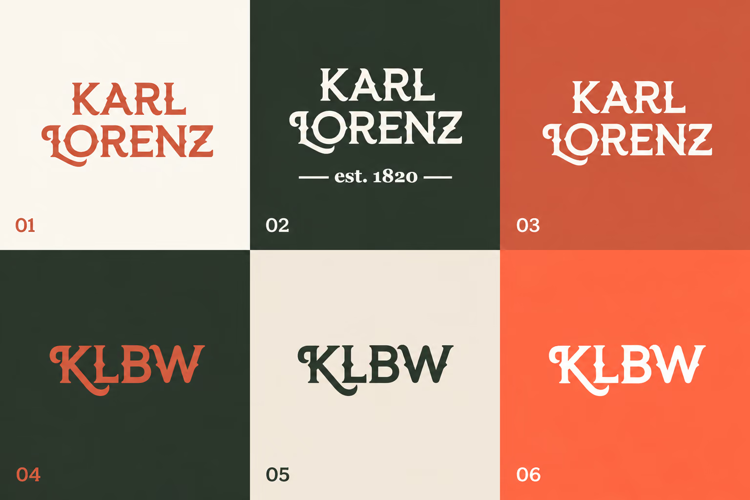
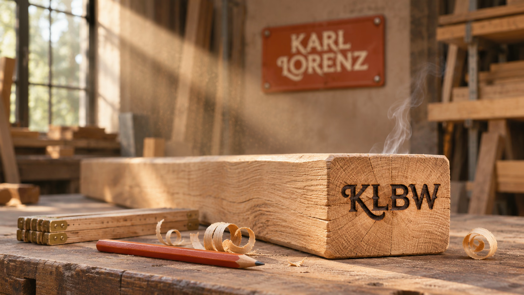
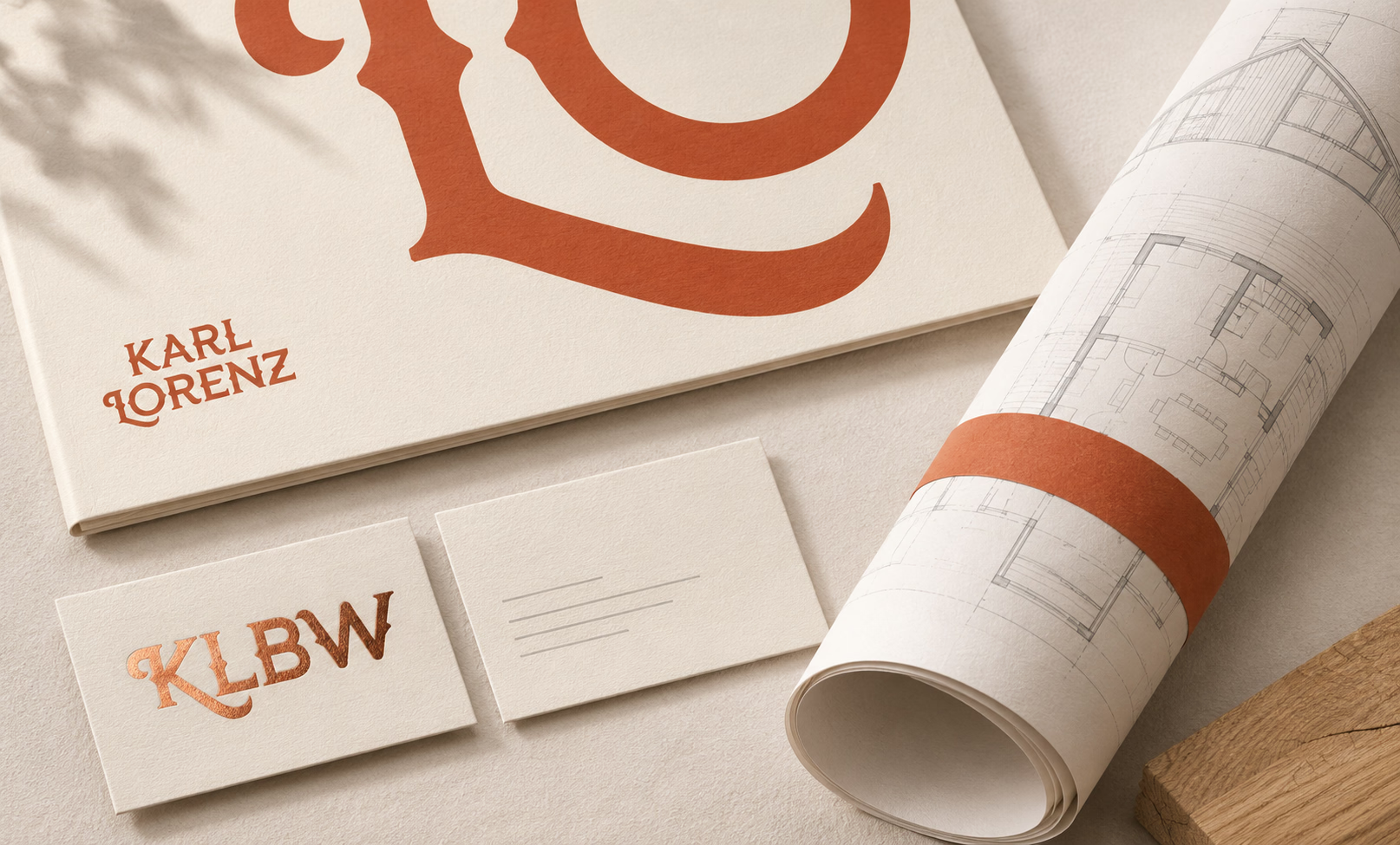
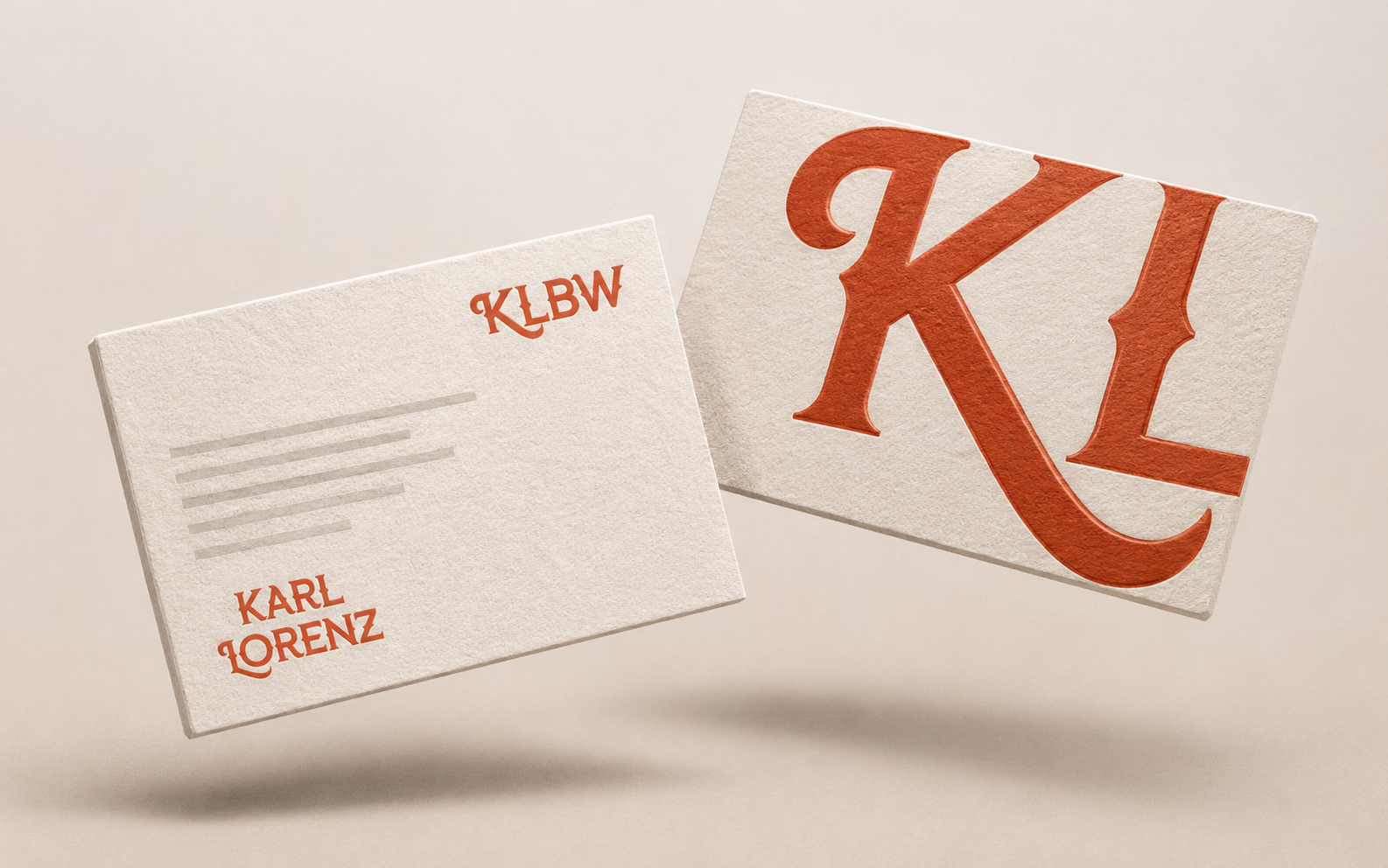
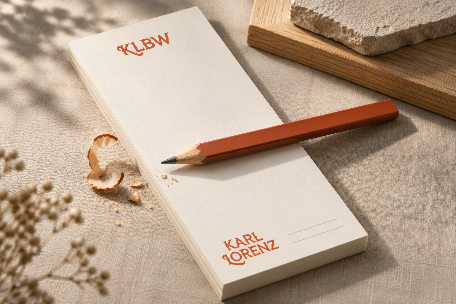
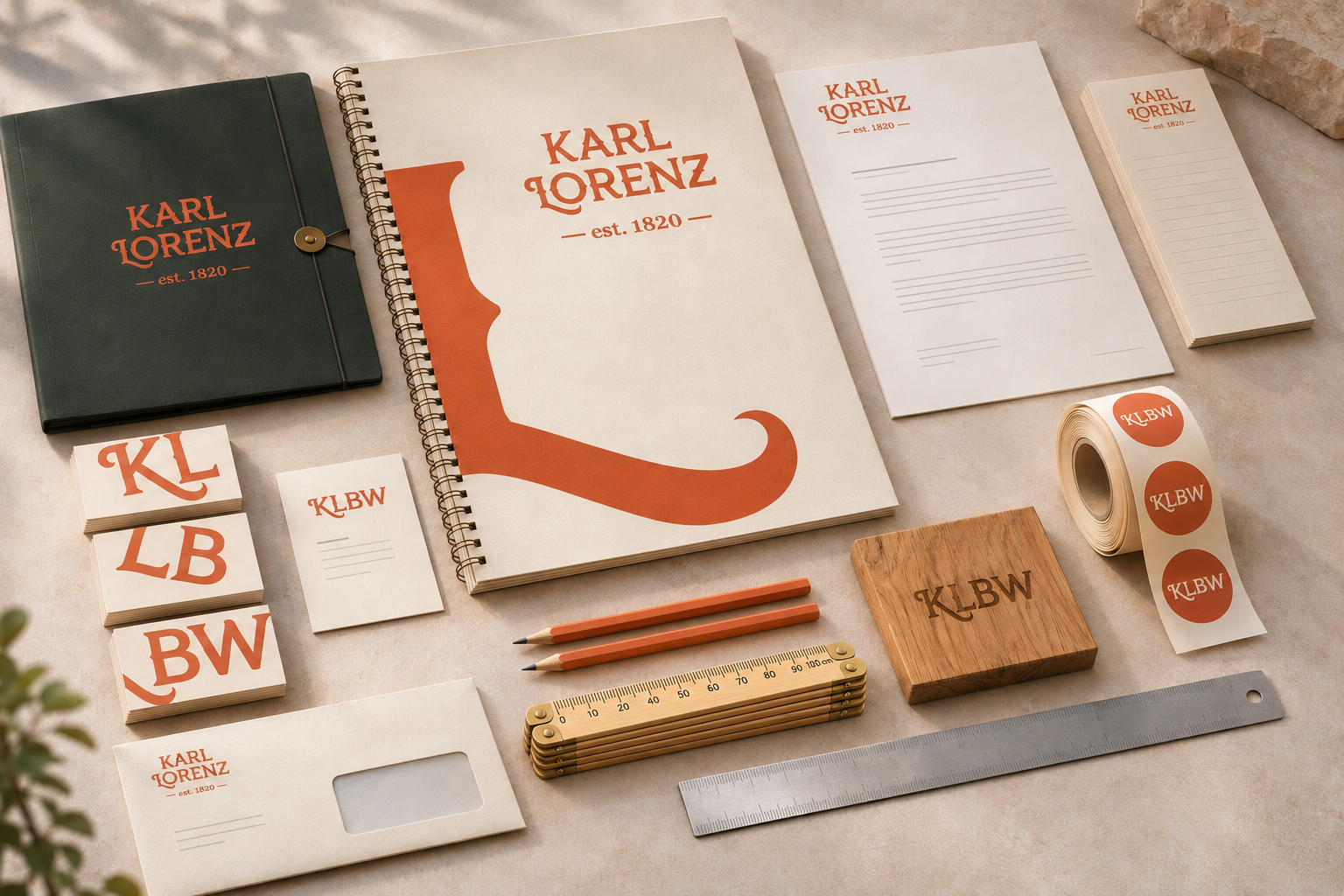
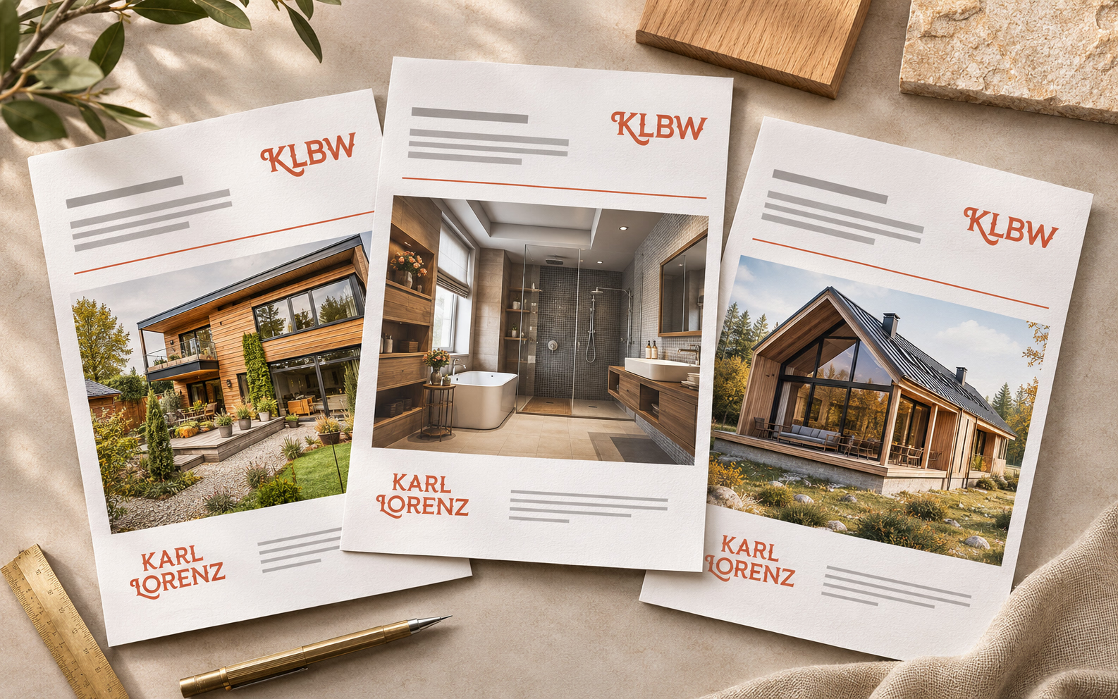
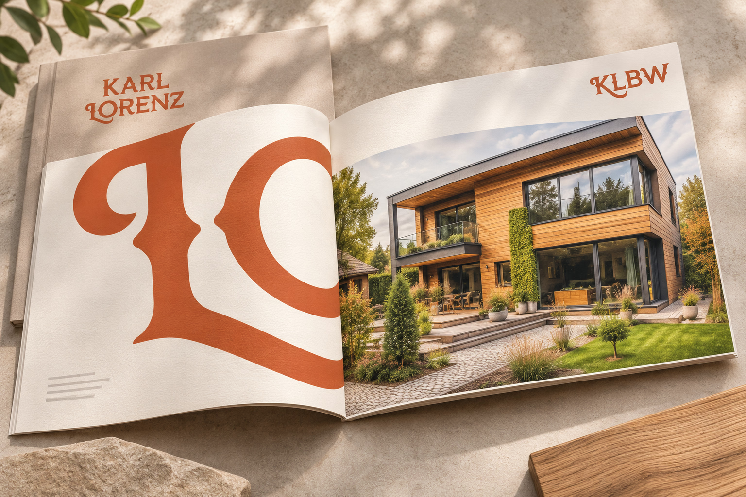
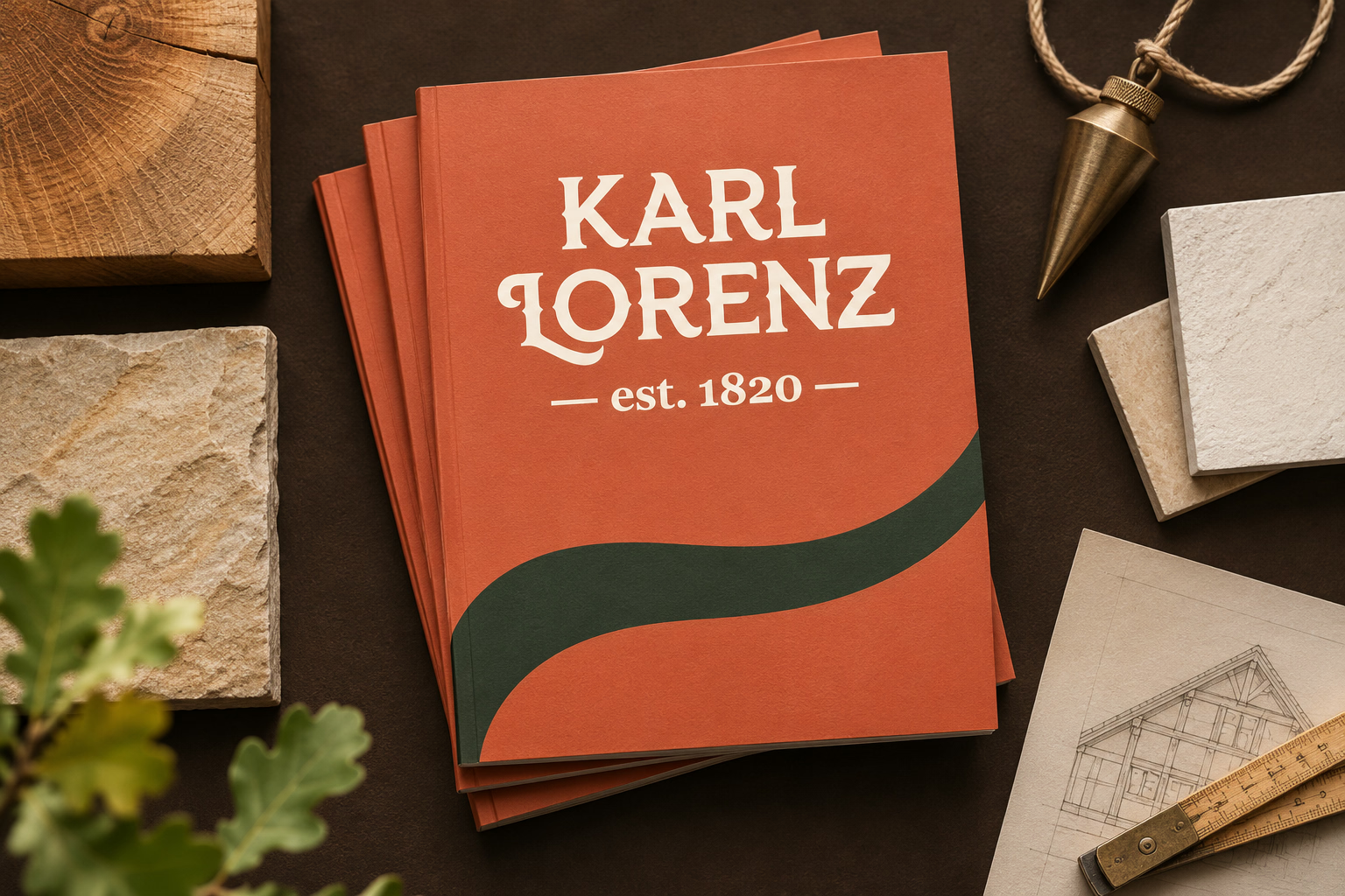
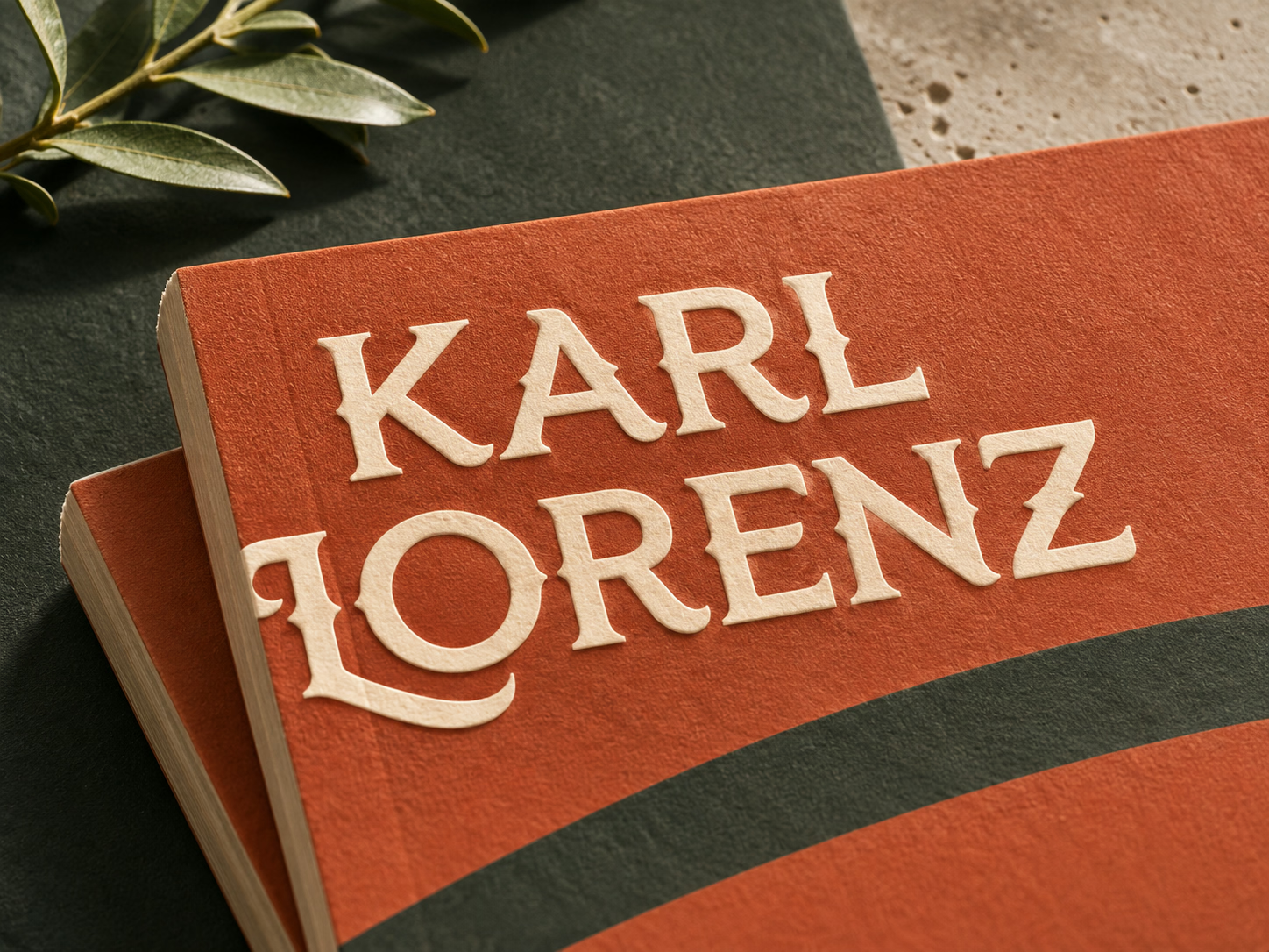
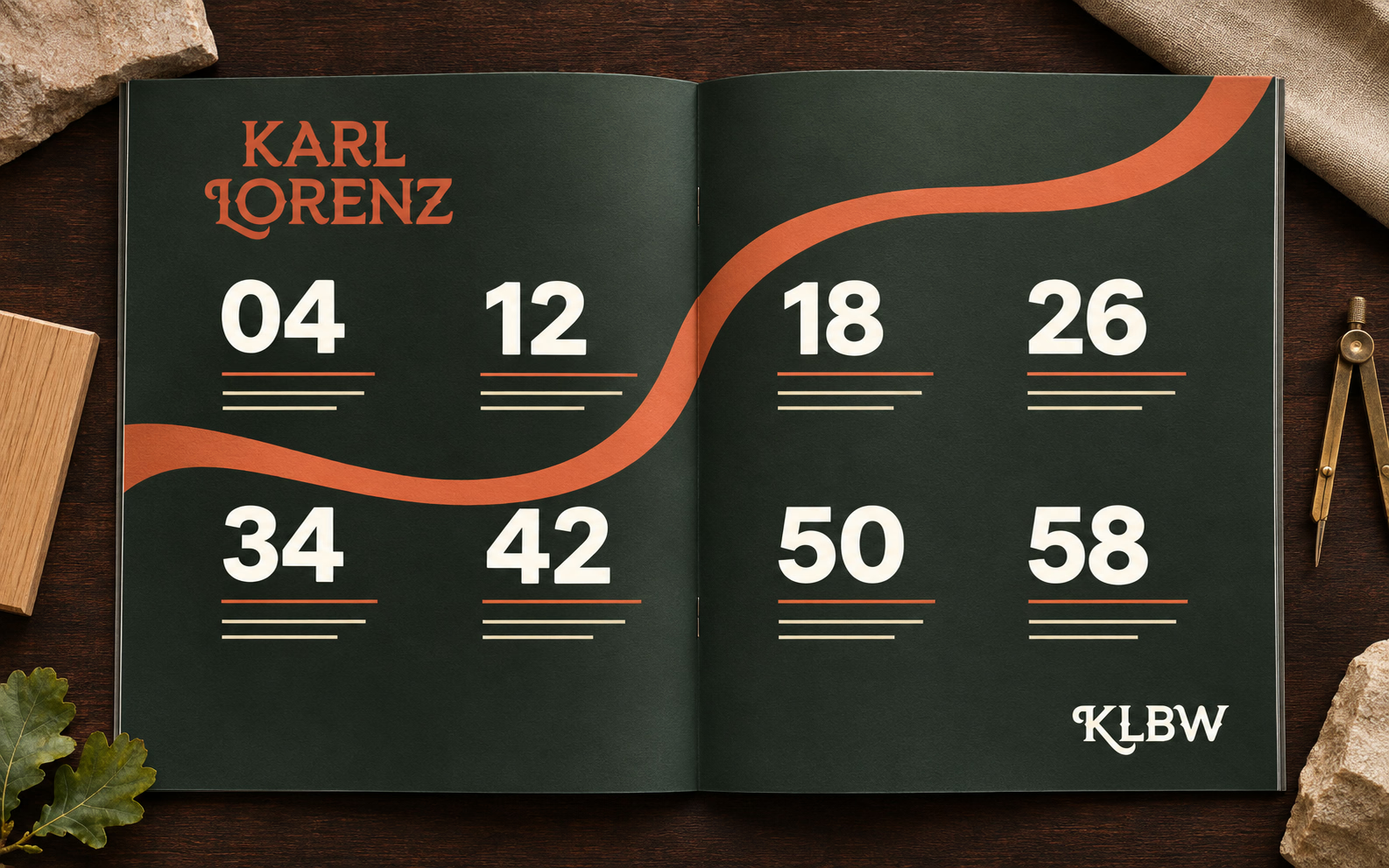
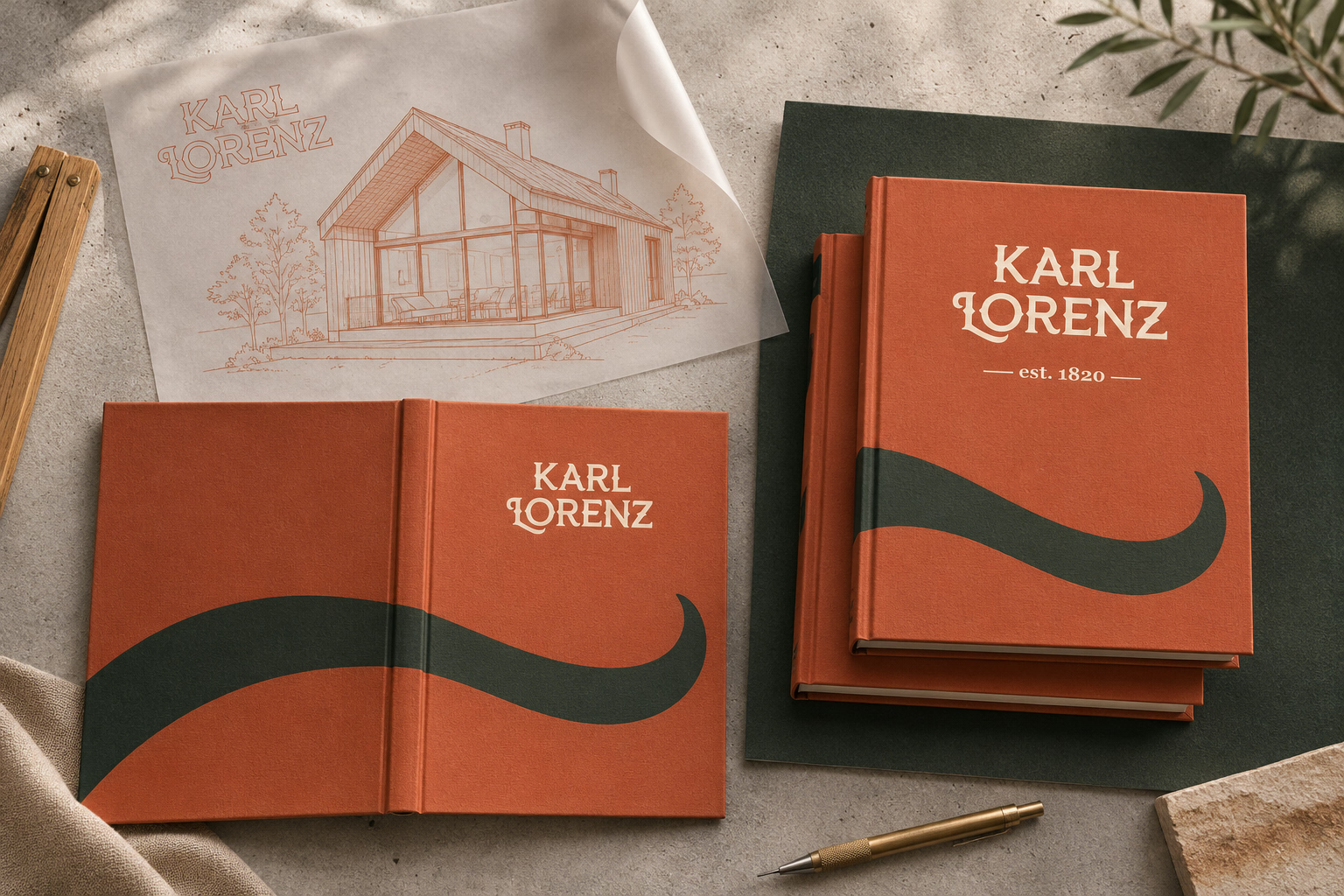
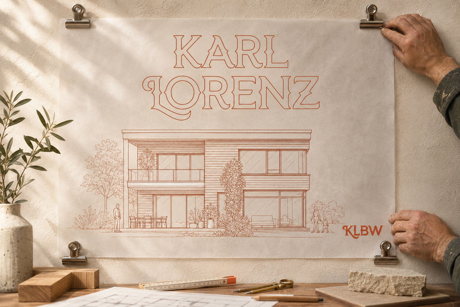
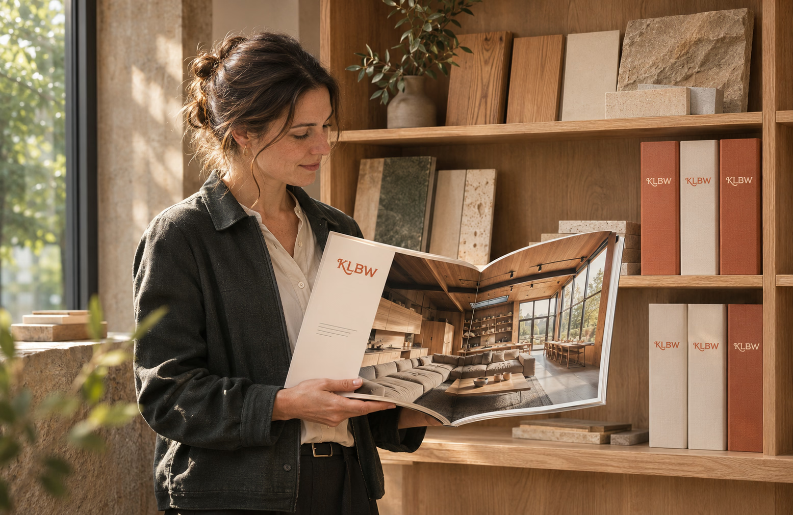
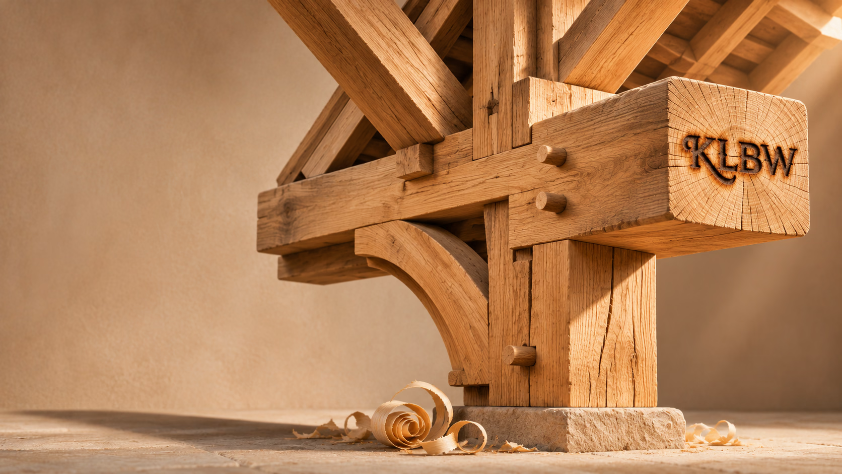
A sturdy brand identity, put together the way a good house is built: from wood, stone and honest craft. Karl Lorenz is a family construction firm from southern Germany, founded in 1820, building timber houses and handling conversions, renovations and bathrooms. Sponge built a system around the swash wordmark and the KLBW monogram: terracotta with forest graphite and cream, the IvyPresto and Open Sans typefaces, a brand burnt into oak and applications: business cards, folders, brochures, books and site banners.
A venerable firm with two centuries of history needs an identity that looks as solid as its houses, and that is what it got.
To the credits