Promo Website for a Construction Store
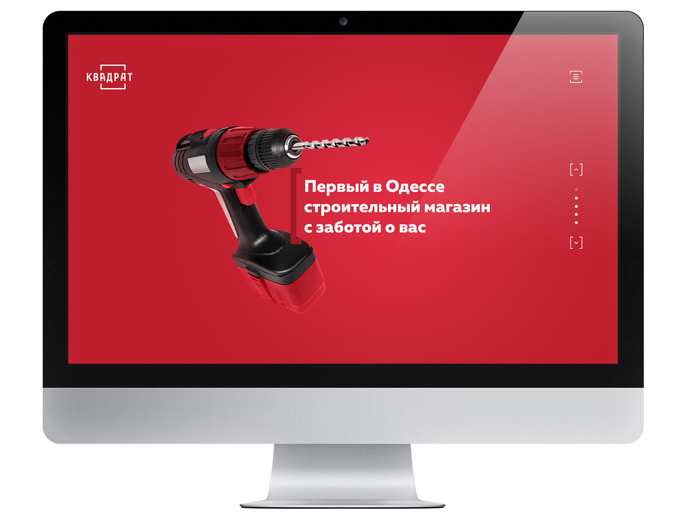
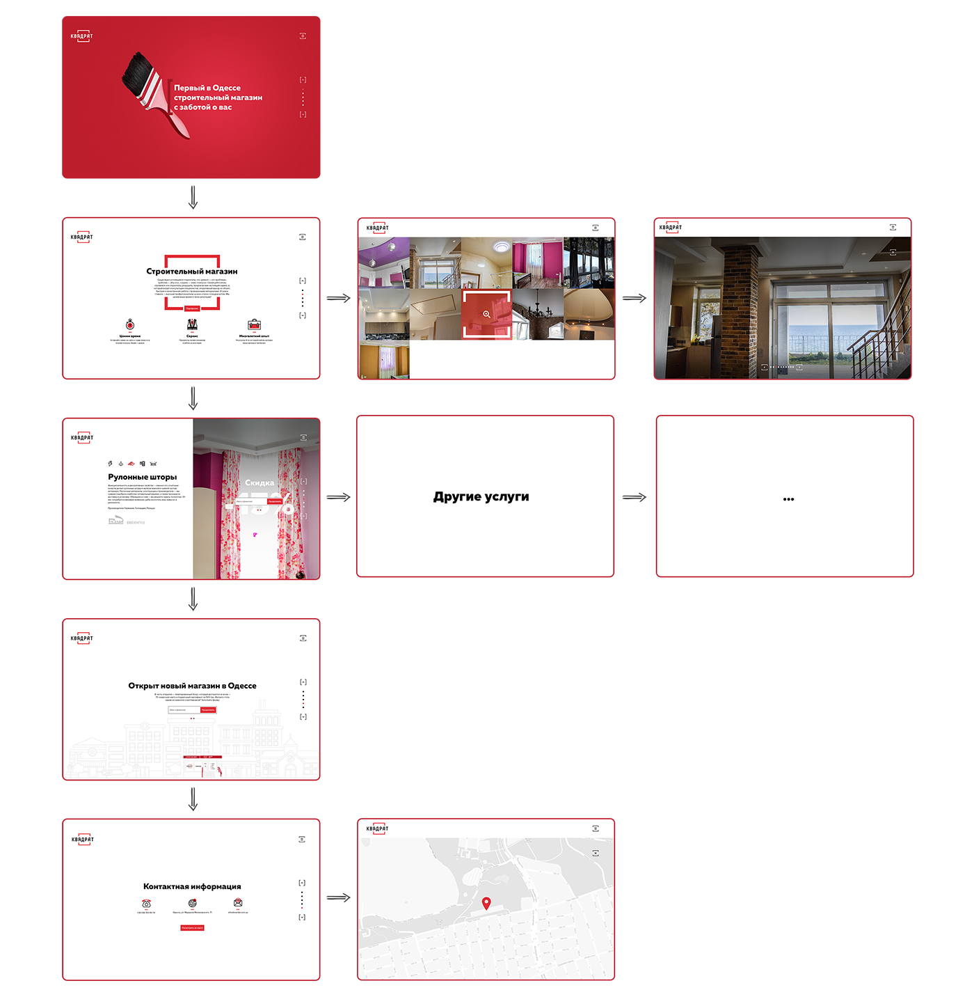
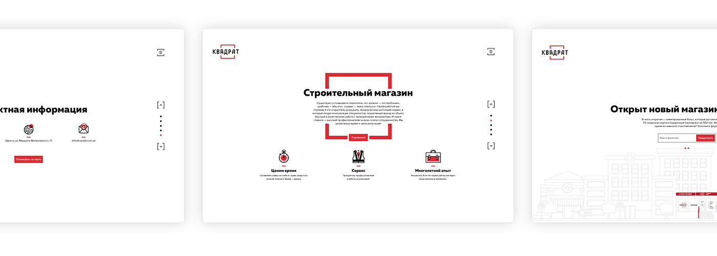
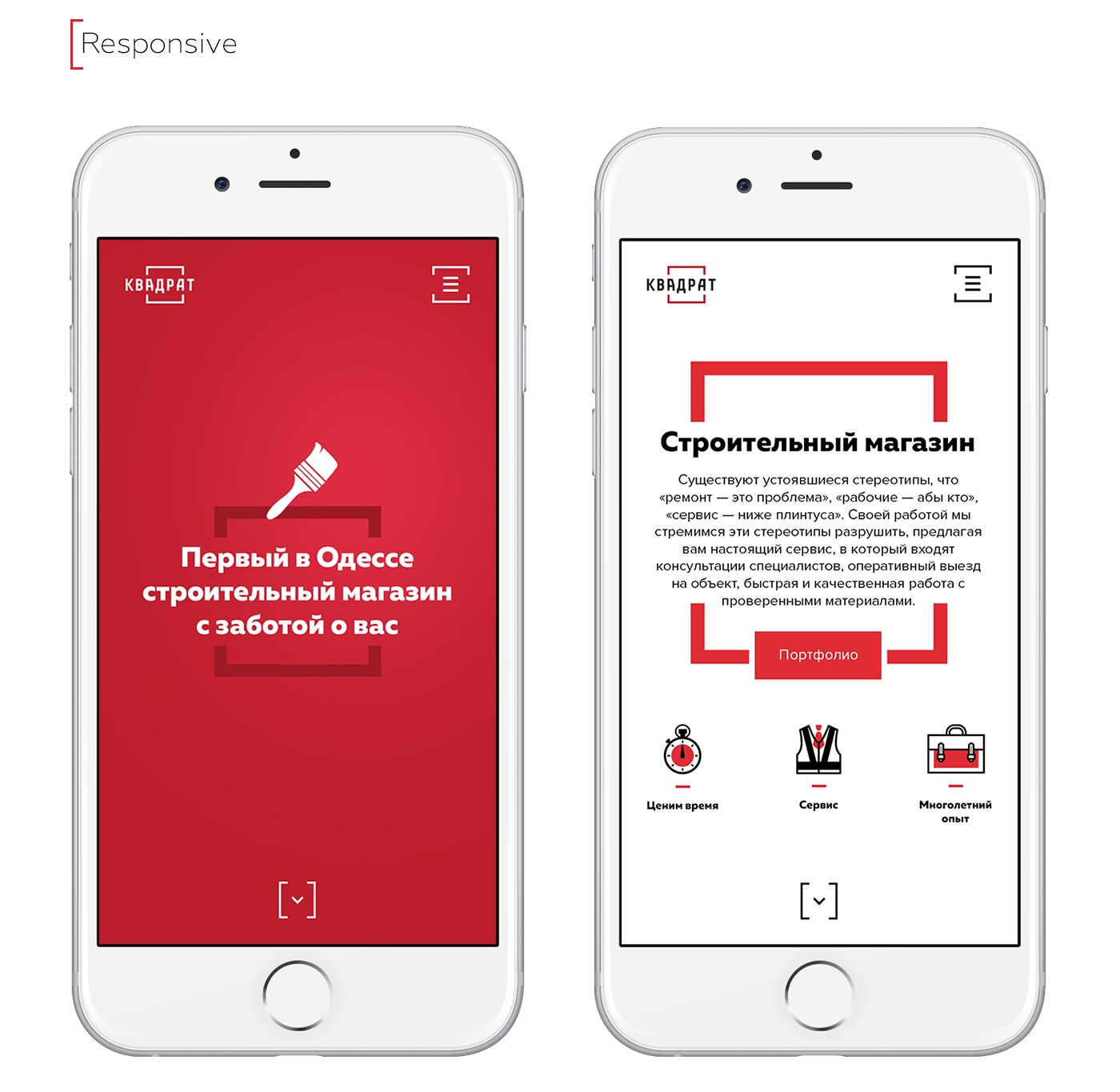
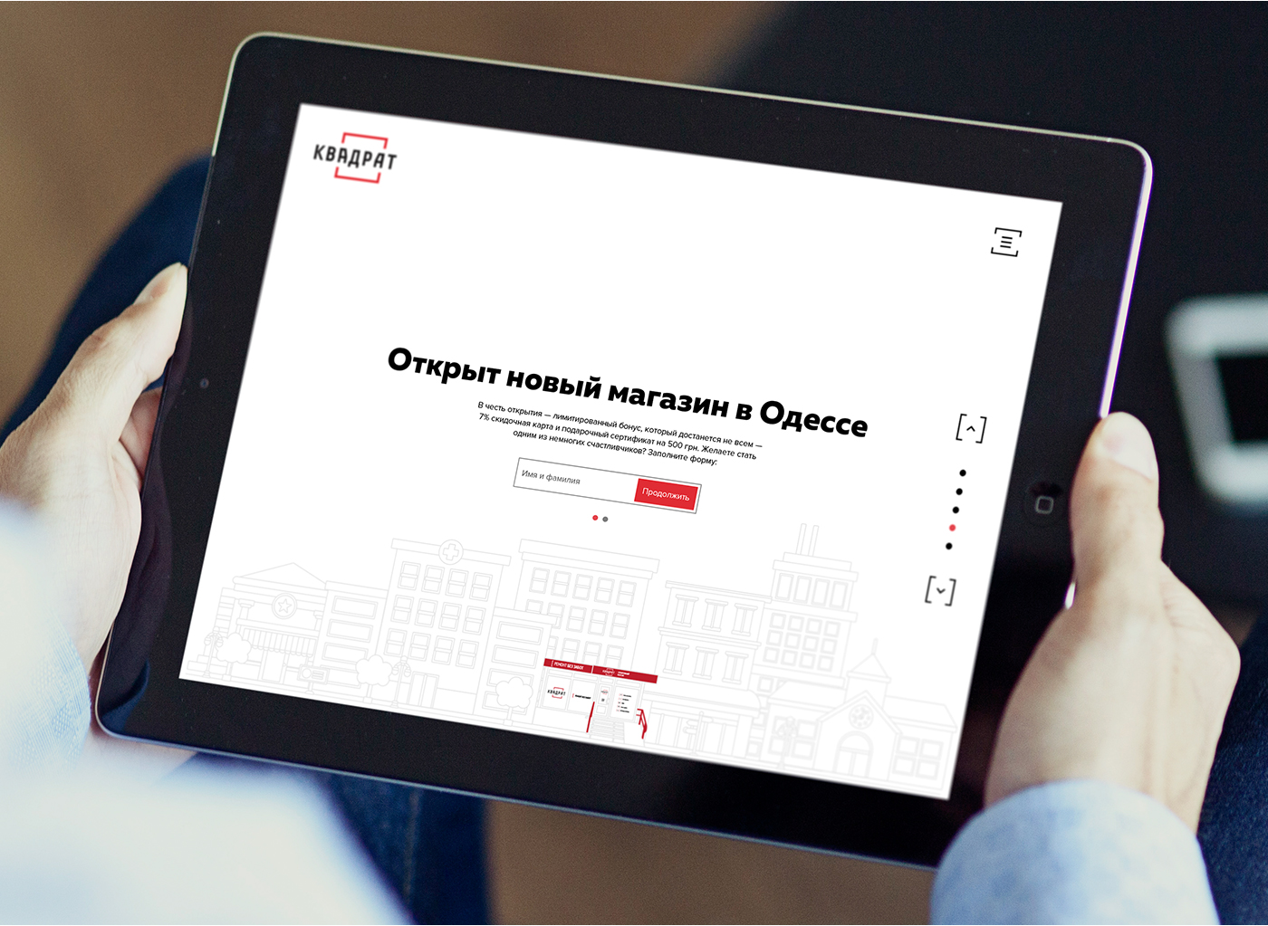
They say renovation is stressful. We decided to start with something simple: create a website that doesn’t irritate. For “Kvadrat,” we designed a clean promo page where each block works like a precise tool — no unnecessary noise, just clarity and rhythm.
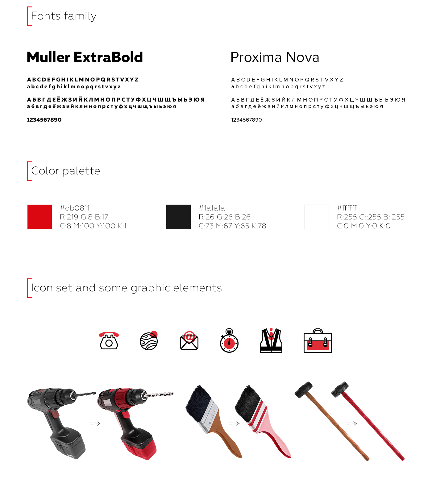
Red as a signal for action, geometry as a promise of order, and a structure that feels like a well-planned renovation — everything in its place. This is not just a store presentation, but an invitation to do it right from the start.
And it seems the client values it just as much as perfectly smooth walls after plastering.