Logo for a Media Brand That Gets Straight to the Point
In the world of news, it’s not only what you say that matters, but how you look. For More News, we created an identity that works as clearly as their editorial policy — no noise, no excess, just the essence.
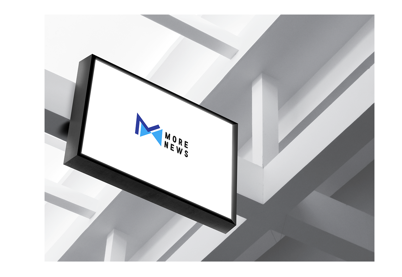
The graphic mark is built on dynamics and motion — the “M” shape seamlessly transforms into an arrow, symbolizing the flow of information and constant updates. A cool blue palette reinforces a sense of trust and objectivity, while minimalist typography emphasizes the brand’s modern character.
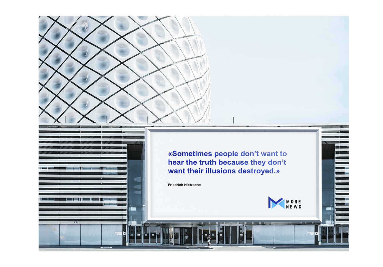
The result is a system that performs equally well on billboards and in digital environments — recognizable, flexible, and honest, just like the news itself.