Fintech Service Rebranding
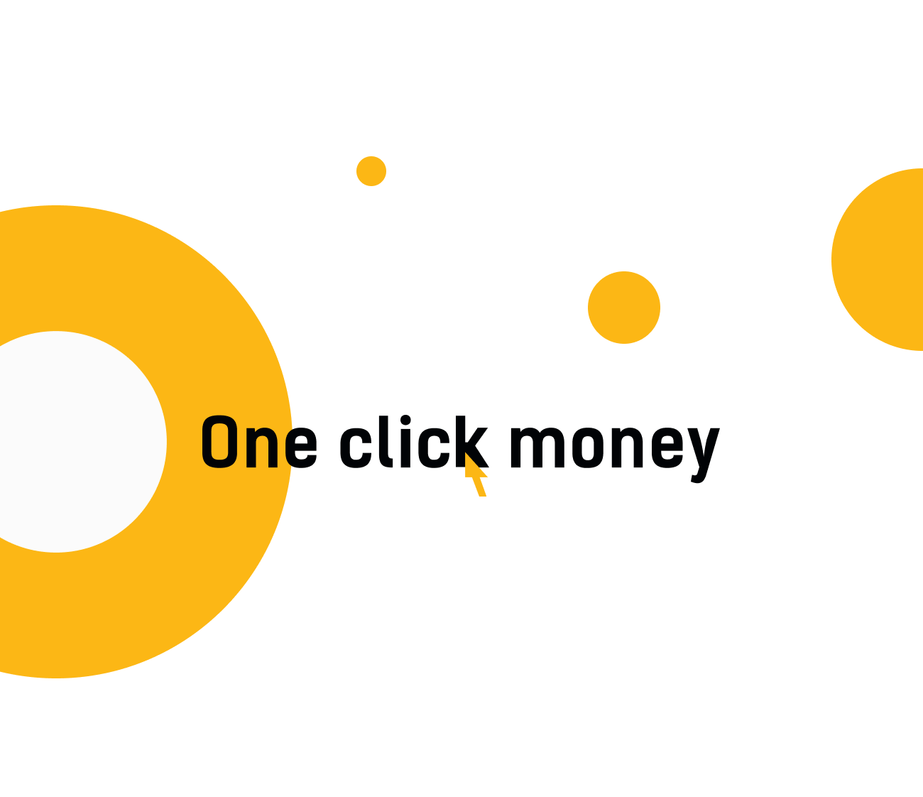
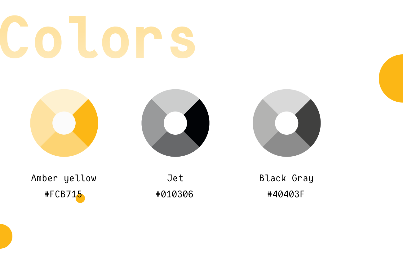
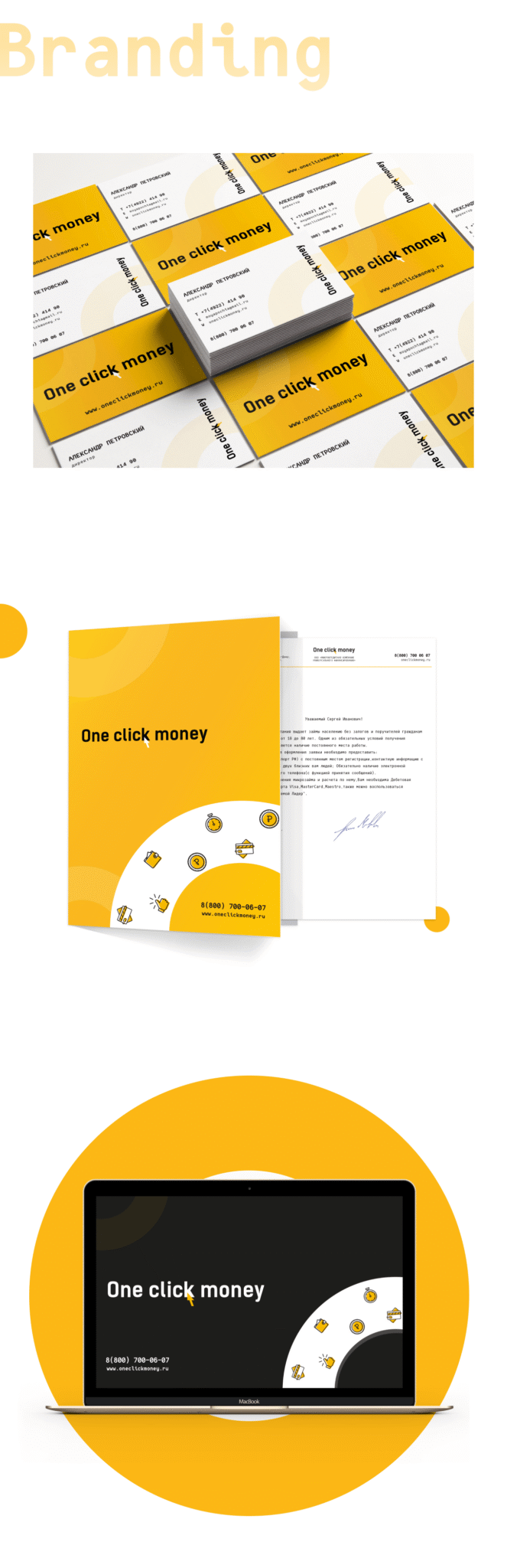
Sometimes, a single click is enough to change not only the balance, but the way a brand feels. For OneClickMoney, we kept the recognizable arrow as a symbol of speed — and rebuilt everything around it: clean forms, a vibrant color palette, and a clear visual rhythm.
The result is a style that doesn’t promise “easy” — it simply looks that way. Because the client’s team has always worked fast, and we just made it visible.