Brand Identity for an International Holding
When a business grows, its logo has to learn to speak different languages — but with a single accent.
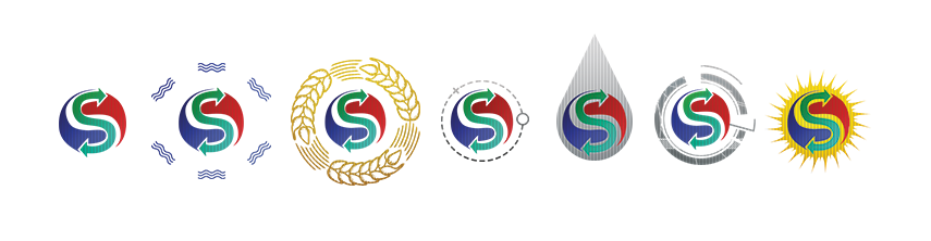
For «Synergy Vector», we created a system where each direction has its own character, yet a shared DNA is recognizable at first glance.
Solar energy, oil, logistics, grain — different worlds united by one sign of movement and interaction.
This is no longer just a set of logos, but a whole ecosystem that scales with the client’s ambitions.
And honestly, watching this kind of growth is a pleasure in itself.