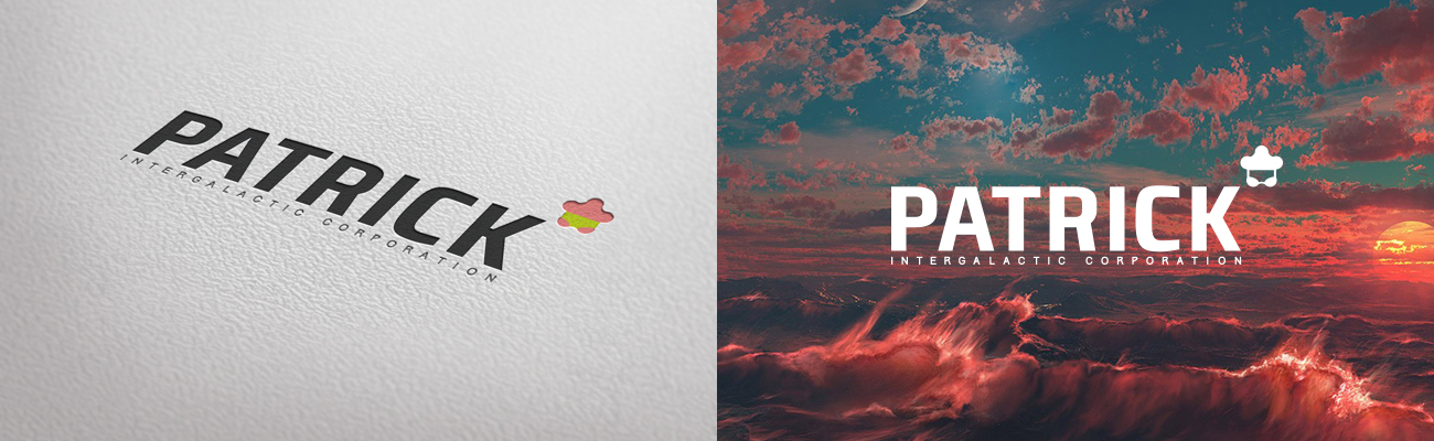
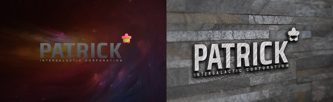
A Logo with a Cosmic Character
For “Patrick”, we created a logo that balances irony and scale. On one side — restrained, almost corporate typography. On the other — a small yet recognizable symbol that adds a layer of meaning, hinting at something beyond just a brand.
This identity adapts easily across environments — from cosmic visuals to physical applications. It’s not overloaded with meaning, yet leaves space for interpretation. And that’s why it works: it looks simple, but stays memorable.