A Brand Identity That Tastes at First Sight
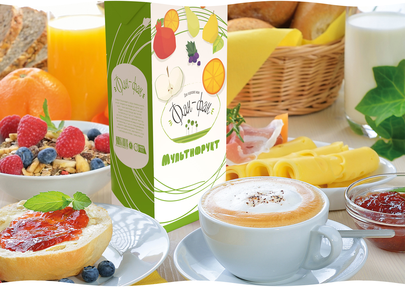
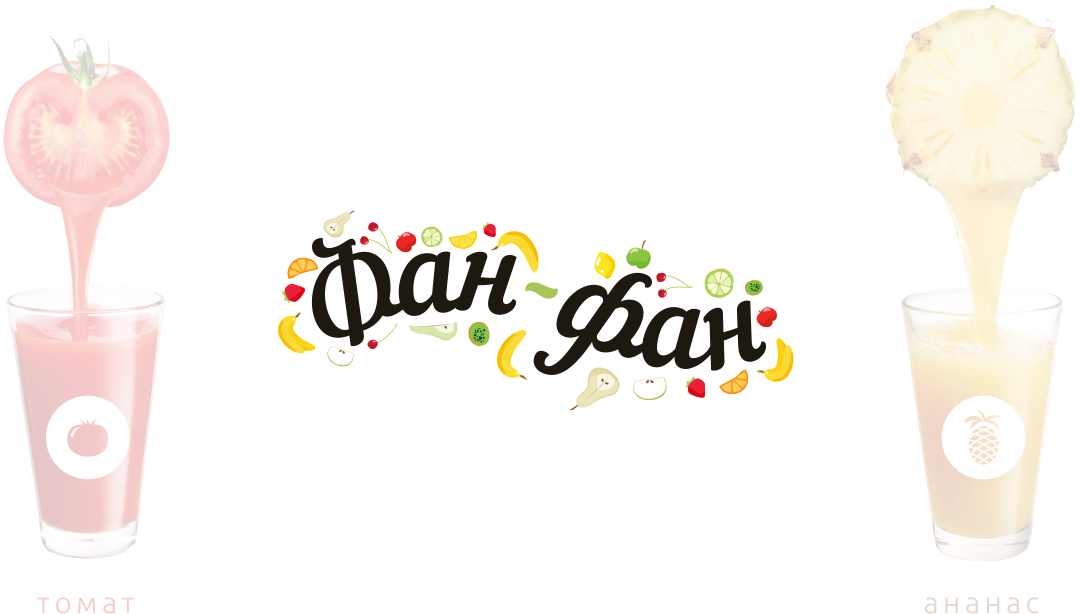
“Fan-Fan” is about lightness, mood, and naturalness. We created a brand that doesn’t just look fresh — it conveys the feeling of morning, fruit, and simple pleasures. The name became the starting point: playful, memorable, alive — and that’s exactly how we shaped the visual language.
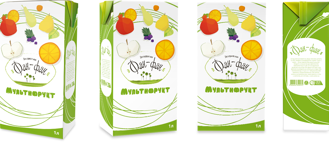
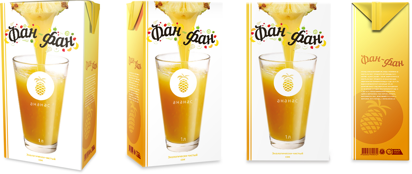
Each concept explored its own character: from a more illustrative and “homemade” approach to a bright, juicy direction focused on the product itself. In the end, we chose a solution that combines clarity of form, appetizing presentation, and a subtle decorative style — without overload, but full of mood.
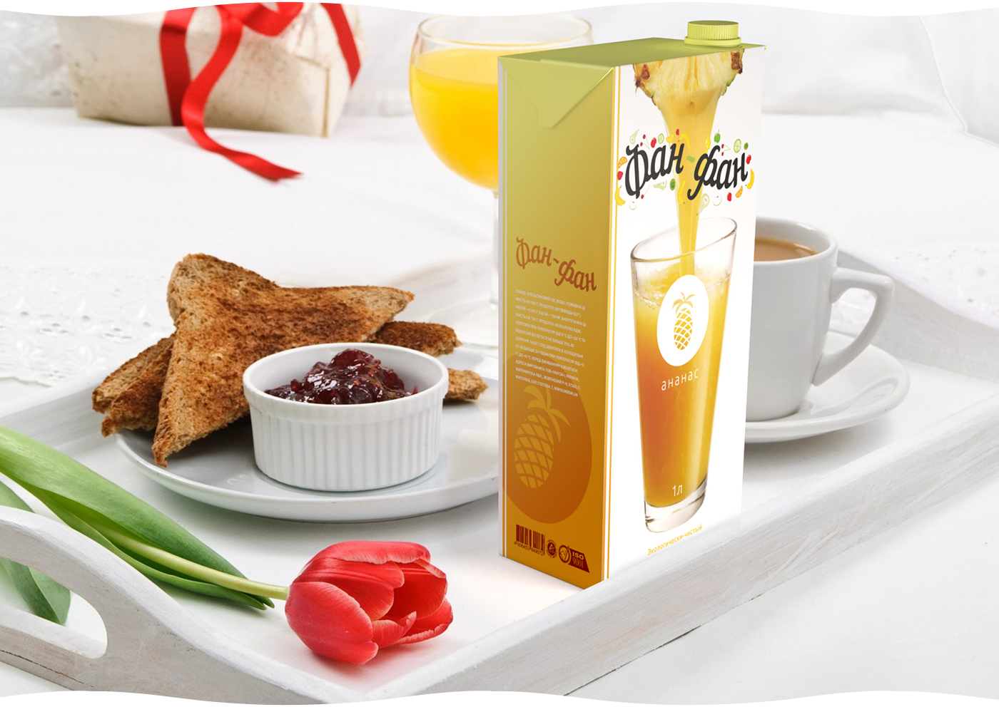
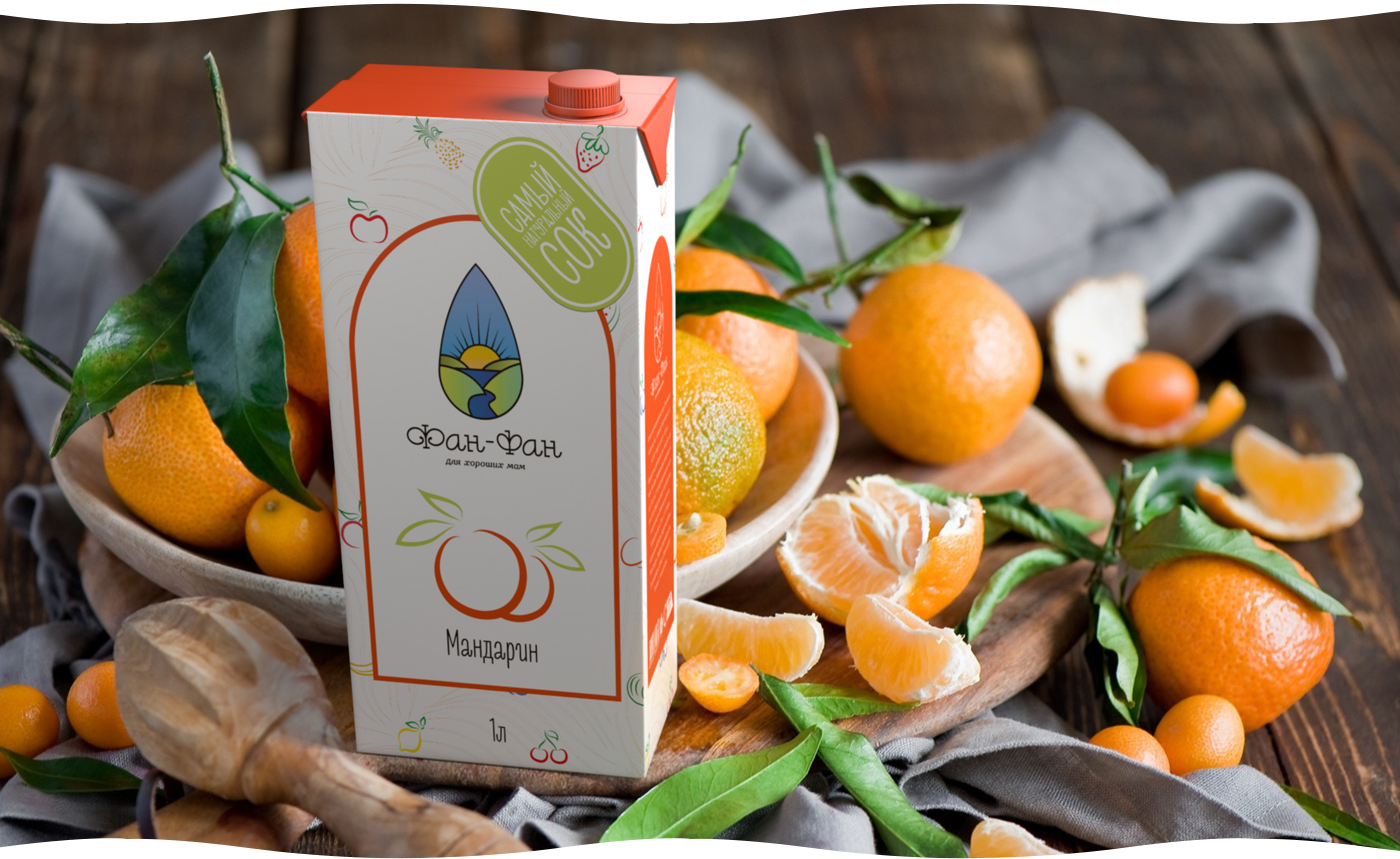
The packaging works like a stage: juices look natural, colors feel honest, and the graphics are friendly and easy to understand. It’s a product that doesn’t need explanation — it instantly builds trust.
Because good juice is not just about taste. It’s an emotion you want to take with you.