Logo for a Cryptocurrency Exchange
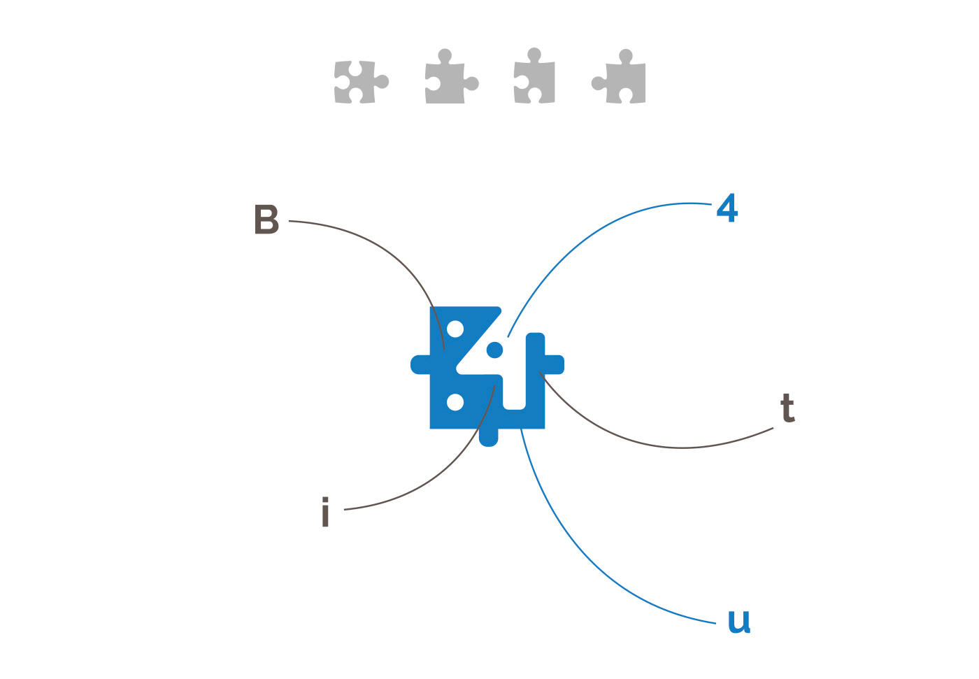
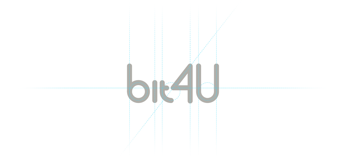
In a world where everything is built on trust in the invisible, form matters more than words. For Bit4U, we created a mark that looks simple but thinks complex: geometry balancing between the number “4”, the symbol of exchange, and a sense of technological precision. The logo seems to speak the language of data science — without unnecessary hype — clear, confident, and to the point. And it feels like this is exactly the case where the client’s team understands: the future is not hype, but system thinking.