Rebranding That Builds Trust
When a brand is already strong, changing it is harder than creating one from scratch. But for “Odrex”, this wasn’t about risk — it was about precision. We didn’t invent a new story — we refined it, made it clearer, more modern, and closer to people.
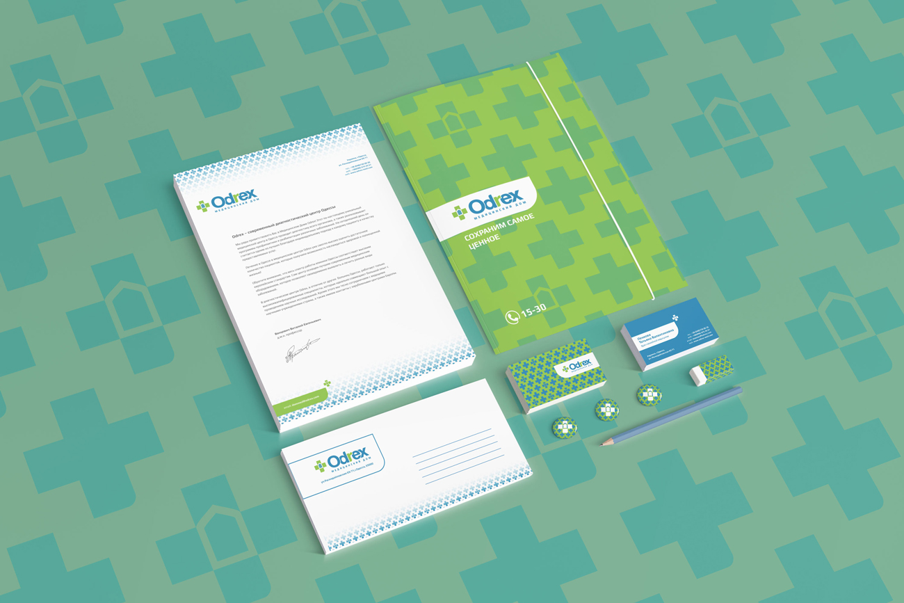
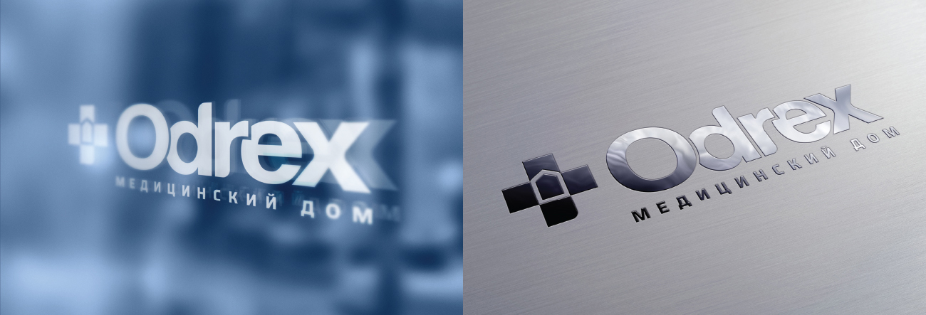
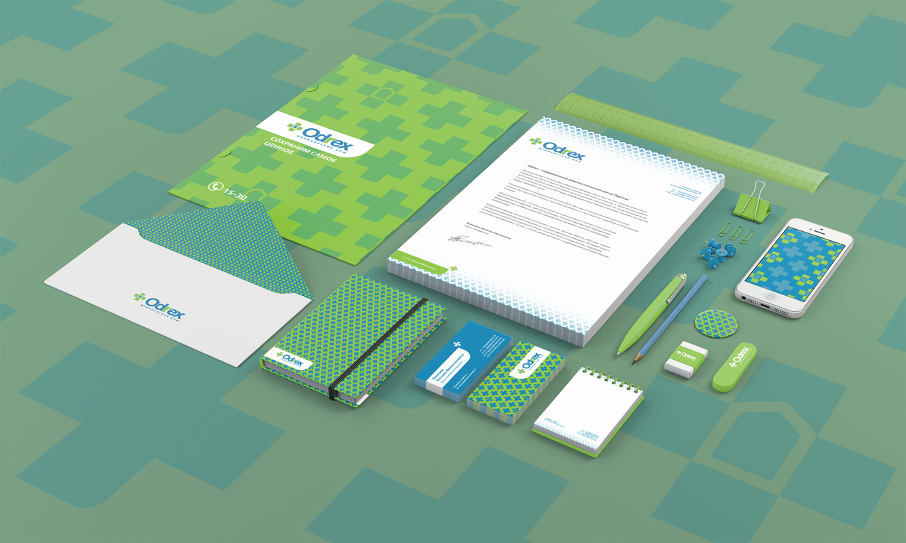
The updated identity balances technology and care. The geometry of the medical cross became a system — shaping patterns, navigation, and visual details. The color is fresh and clean, like the feeling after a correct diagnosis. The graphics are intentionally simple, so nothing distracts from what matters.
This is a case where design doesn’t try to stand out. It simply does its job — like good medicine: quietly, precisely, and with results.