A Logo Built from Meaning
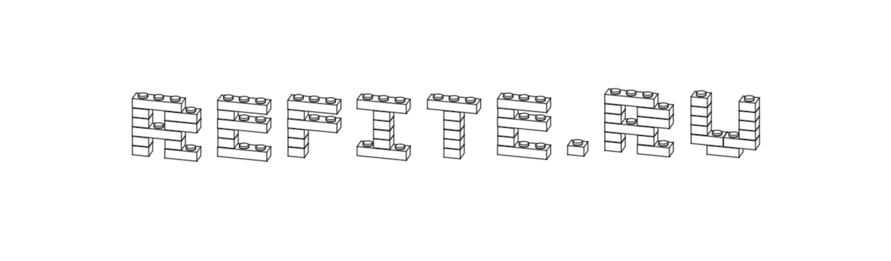
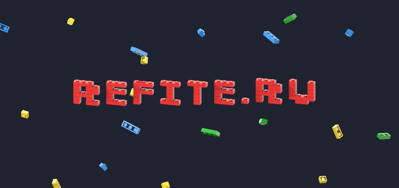
When a brand speaks about construction, the logo shouldn’t be drawn — it should be assembled. For “Refite”, we took the simplest idea: everything is made of blocks. Then turned it into a visual language where every letter feels like it has just been constructed.
This is not just a form — it’s a process. The same one behind any renovation: from scattered elements to a clear structure. A subtle touch of construction-playfulness adds humanity to the brand — because even serious things can be built with enjoyment.
The result is a mark that’s not only about construction. It’s about control over space — where everything falls into place.