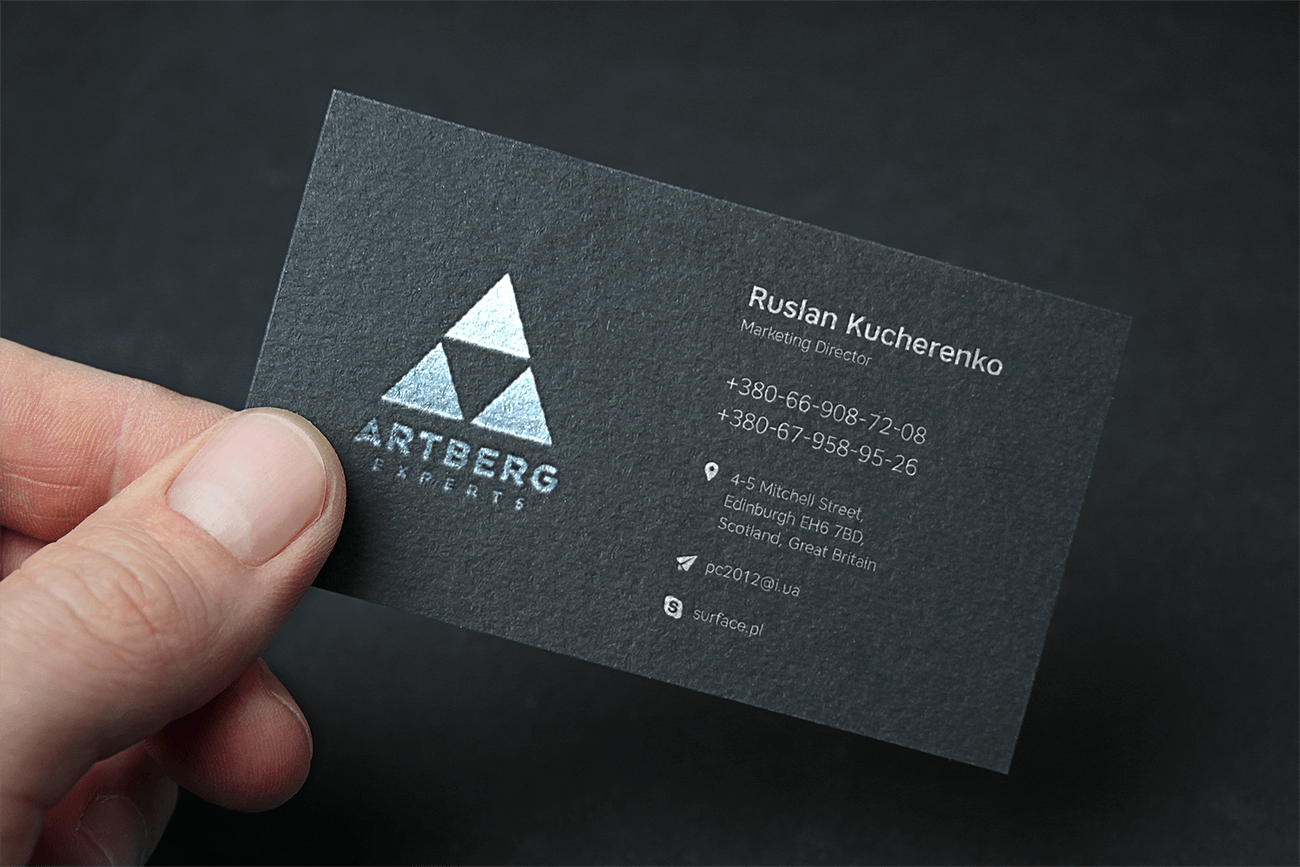
Brand Identity for an Engineering Company
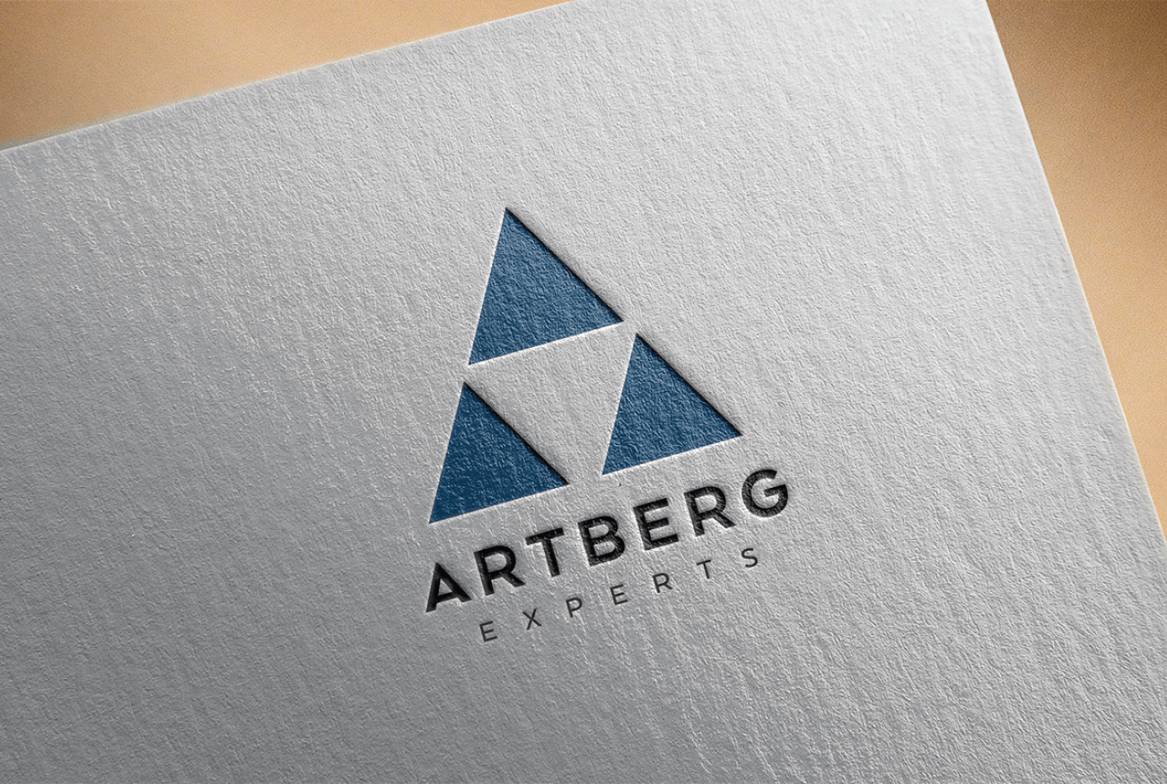
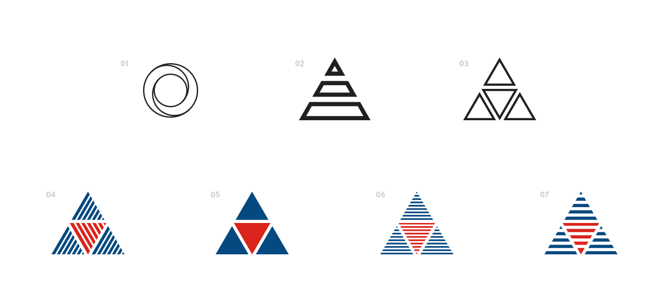
Strength lies in simplicity. For Artberg Experts, we created a mark that speaks the language of form: a triangle as a symbol of stability, structure, and precision. Nothing excessive — just geometry that reflects the essence of the business: metal, construction, reliability.
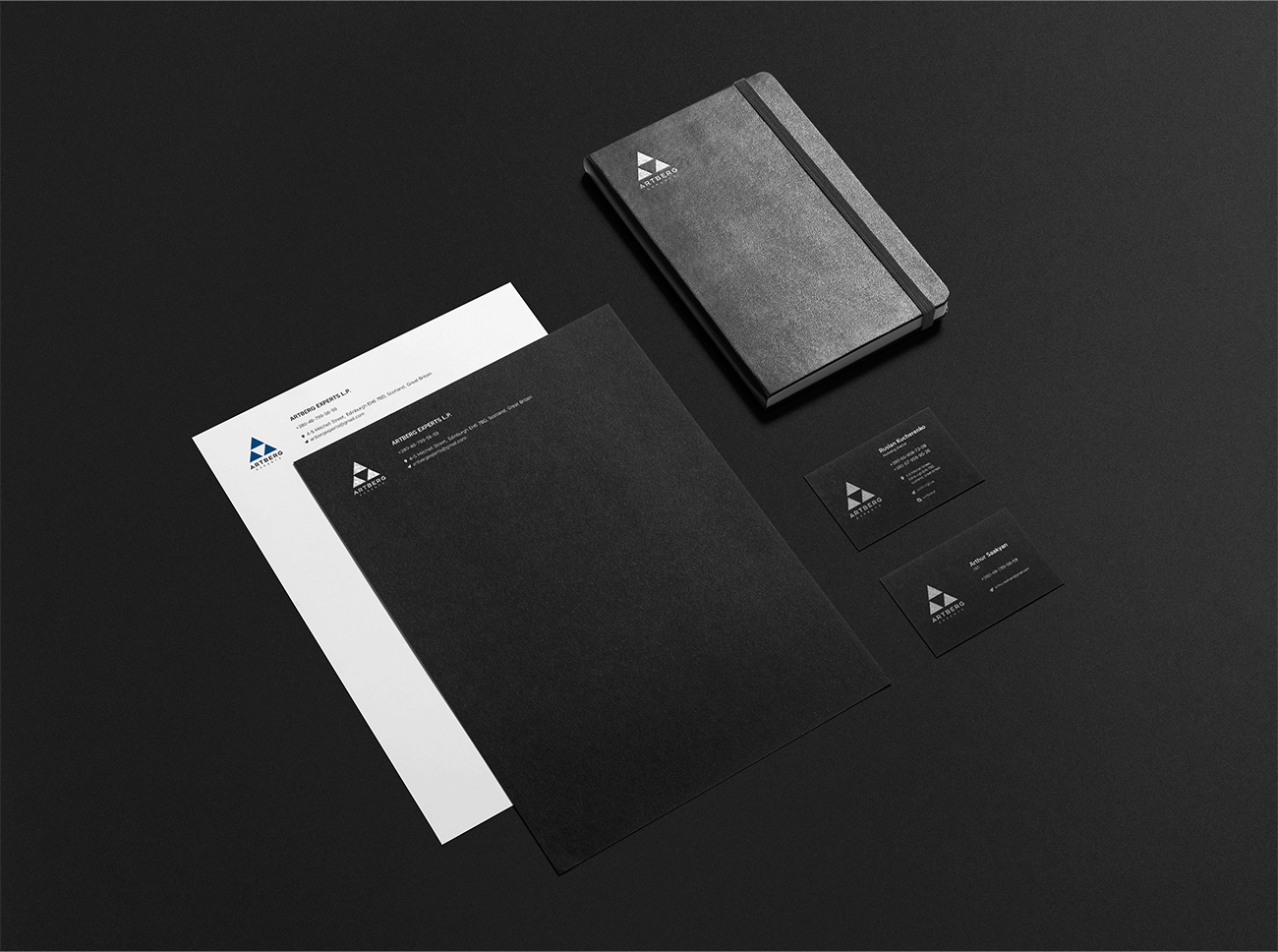
The visual identity continues this idea — restrained, high-contrast, with a sense of weight and tactility. Dark surfaces, sharp typography, and precise accents all contribute to the image of a company trusted with serious projects. British restraint meets engineering precision.
Because good design, like quality metal, is built to withstand pressure.