A Logo Built on Contrast
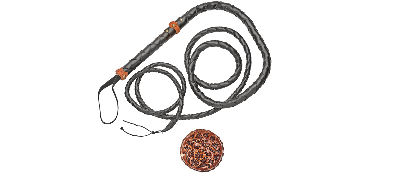
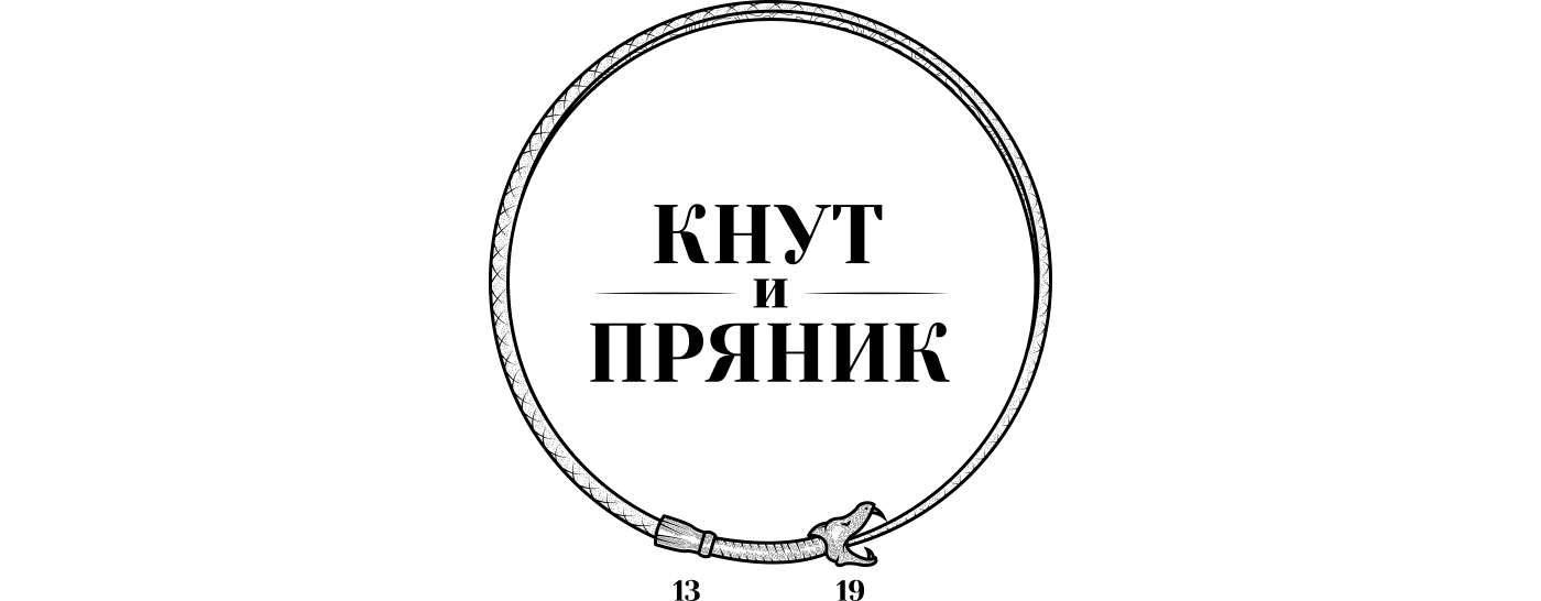
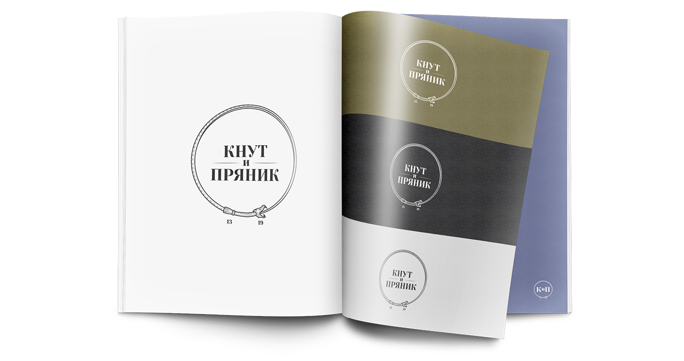
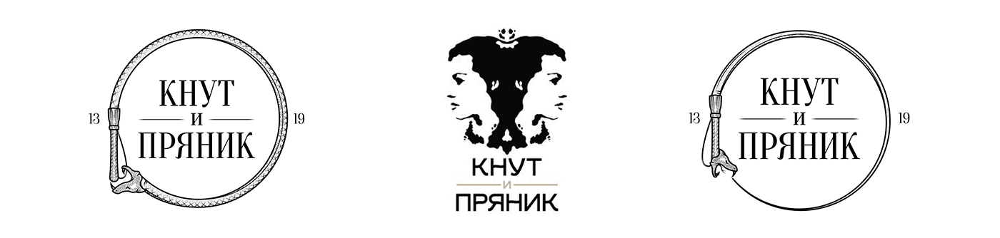
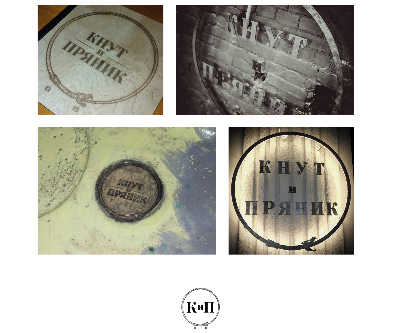
There are places where the menu says one thing, but the atmosphere tells another story. “Knut & Pryanik” is exactly that. We built the identity around the ouroboros — a symbol of an endless cycle, where strictness and softness continuously replace one another.
Here, the whip doesn’t intimidate — it adds a kick. And the pryanik isn’t just a dessert, but a mood. The logo reflects the same idea: slightly provocative, slightly ironic, and deeply self-assured.
And it seems the client feels this balance just as well as the taste of a perfect hot dog after a glass of something stronger.