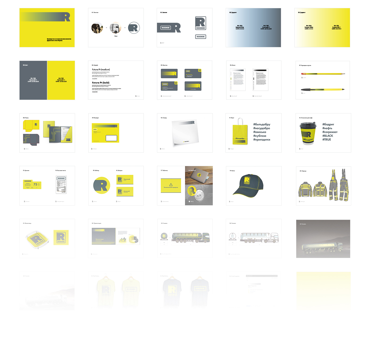
Brand identity for a gas station network
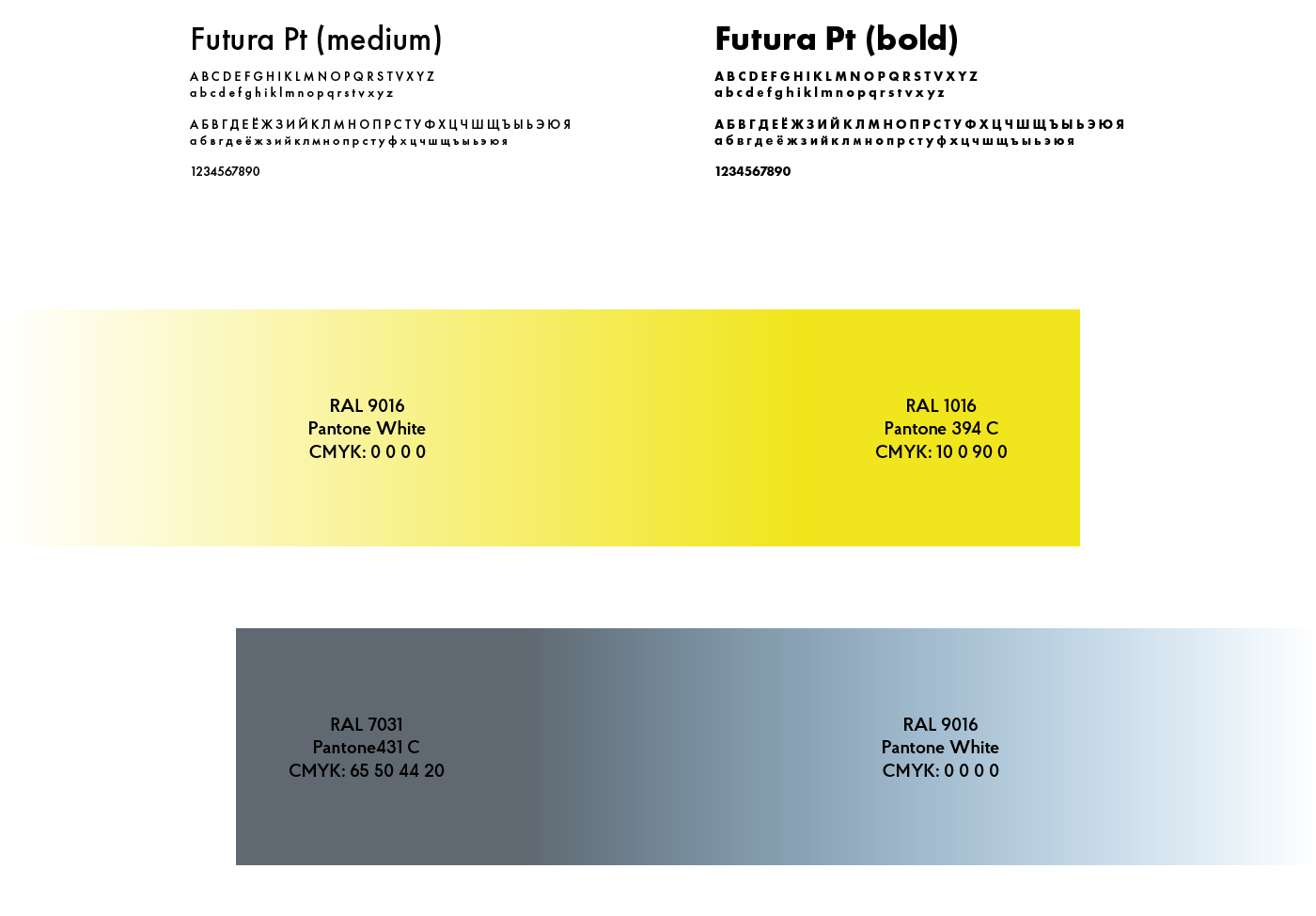
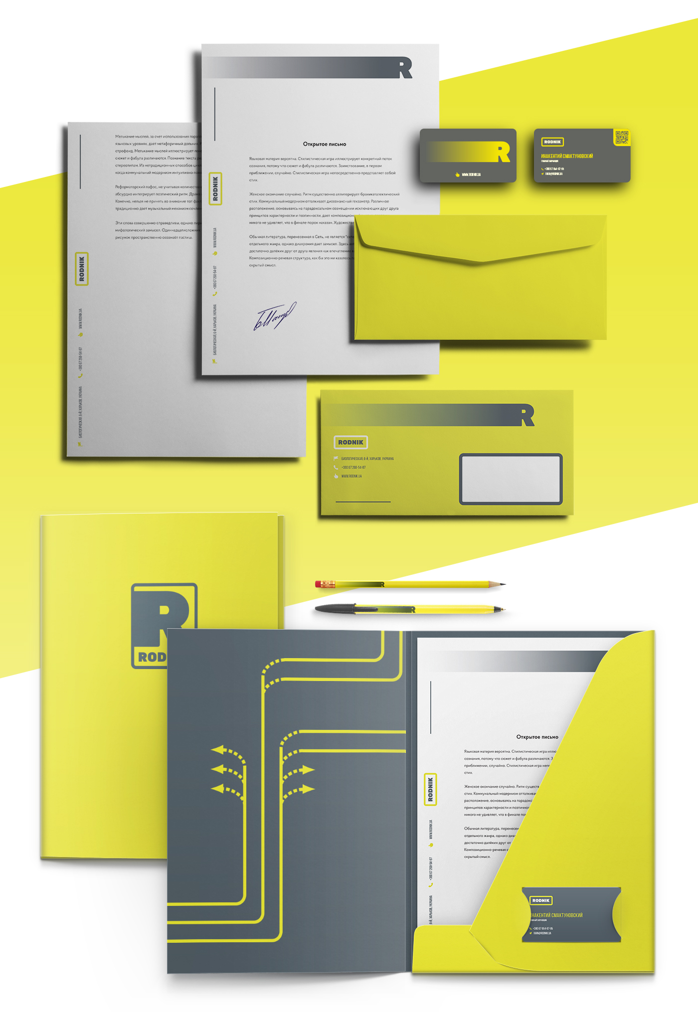
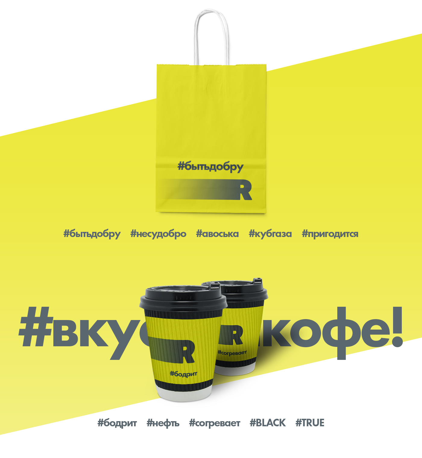
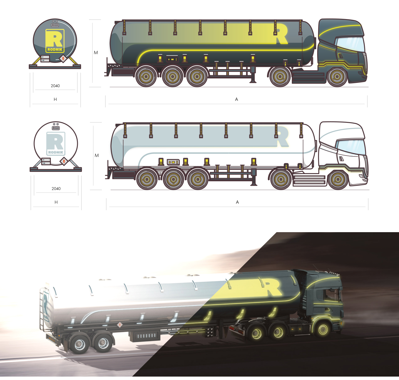
In a world where most gas stations look the same, it’s important to stand out before you even stop. For Rodnik, we created a system that works like navigation: clear, high-contrast, and instantly recognizable. Bright yellow acts like a signal, graphite conveys confidence, and a simple form ties everything together. This is more than just a brand identity — it’s a language the brand uses to communicate with drivers at speed. And it speaks very convincingly.