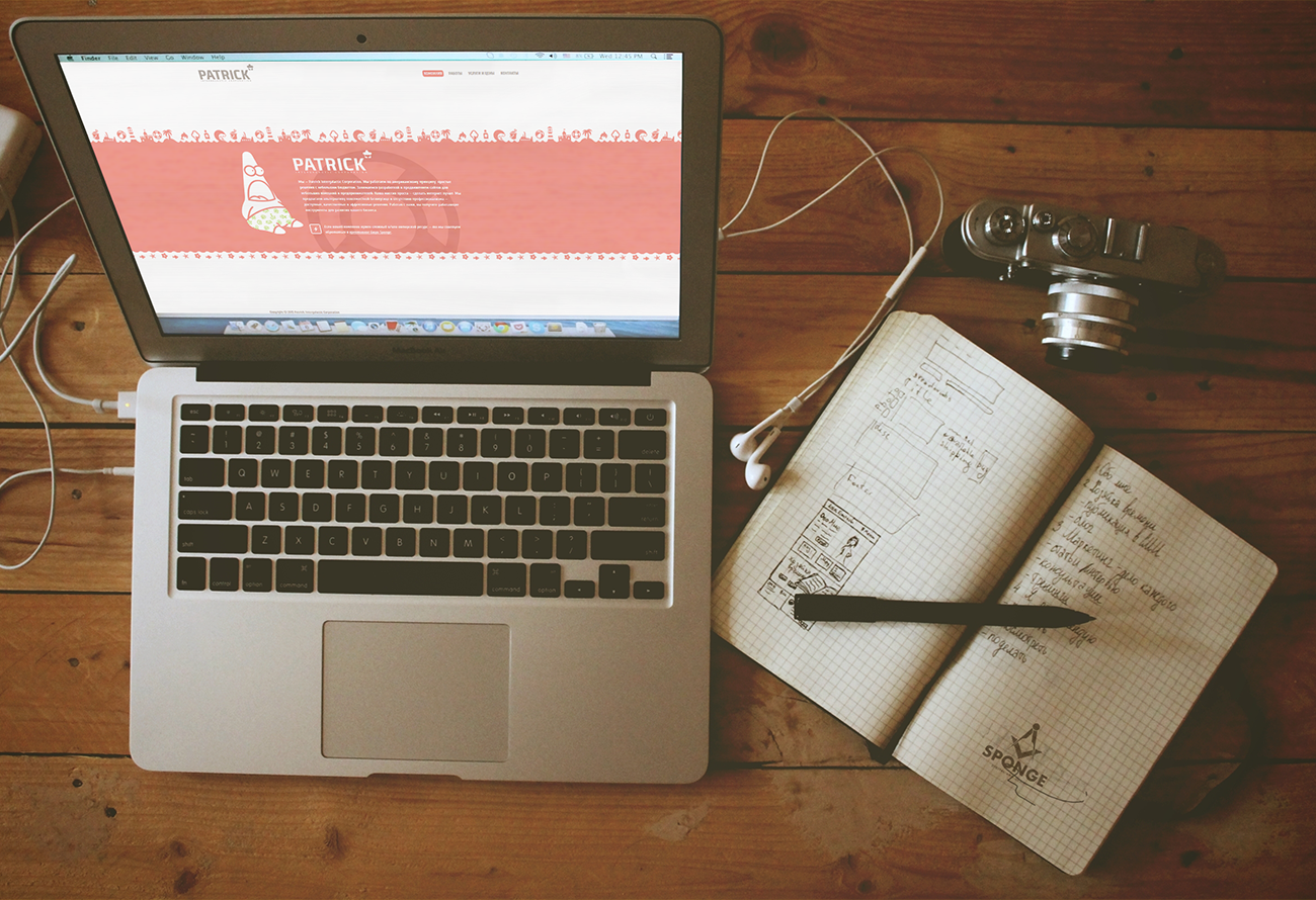
A Website with a Mood, Not Just a Structure
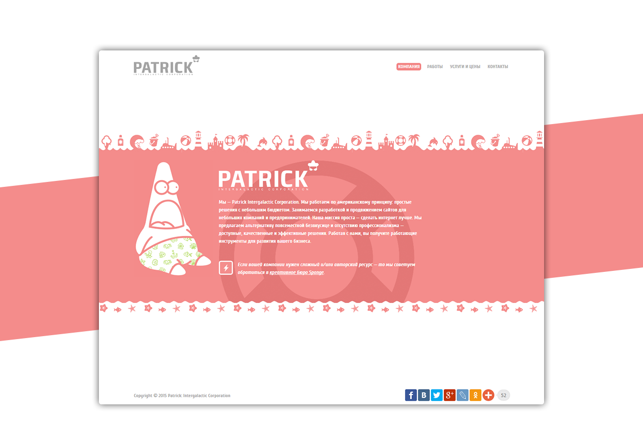
For “Patrick”, we didn’t just build a website — we defined a tone of voice. It’s an interface that isn’t afraid to feel light, lively, and slightly playful, while staying clear and functional.
The visual language is based on simple shapes and recognizable details: icons, patterns, and a soft color palette. Together, they create a friendly environment where communication feels human rather than formal. Even the character adds personality — acting as a guide through the brand’s small universe.
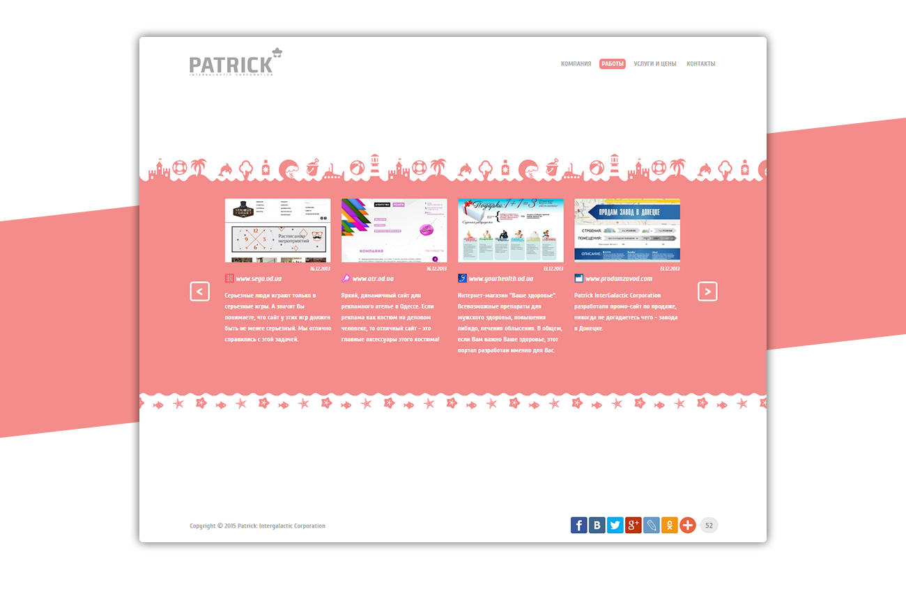
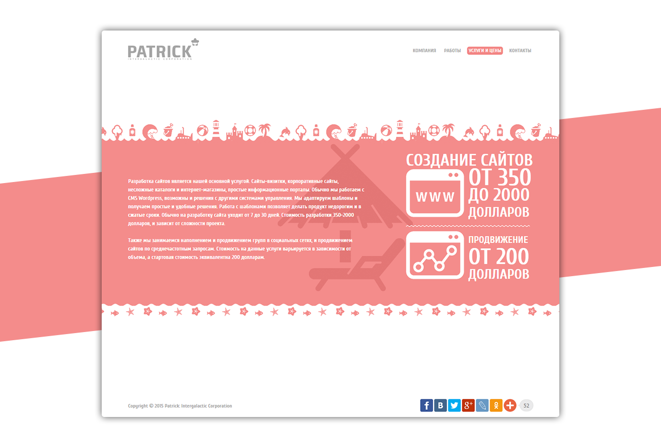
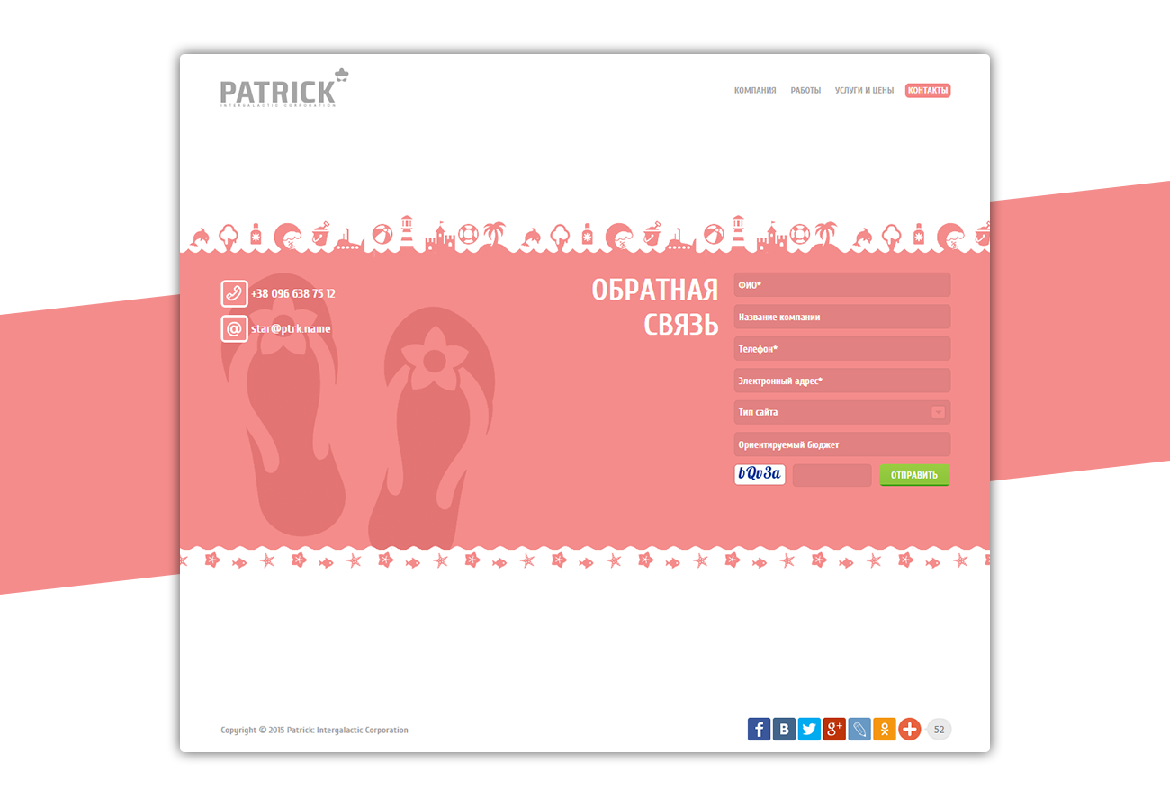
The structure is максимально simple: nothing extra, only what’s needed for quick understanding and action. Contacts, services, work — everything is in place, without overload.
This is an example of how design can feel light, yet work with precision. Because sometimes, to stand out — it’s enough to be genuine.